
Creating Responsive Font Sizes Based on the Viewport
Introduction
Previously, responsive typography required a series of media queries, font definitions, and other complexities. All of that has changed thanks to widespread browser support for variable fonts and the all-important CSS clamp() function.
I'll show you how to linearly scale text between a set of minimum and maximum sizes when the width of the viewport changes, with the goal of making its behaviour at different screen sizes more predictable without the use of media queries and with only one line of CSS.
Although this article concentrates on responsive font sizes, you can use clamp() very effectively with any other object you need to size with limits, particularly containers and images.
Included is a handy on-screen calculator to build your font sizes and view the results in real-time.
You must be using a variable font for this to be effective. Using non-variable fonts will likely result in blocky or fuzzy edges in between whole pixel values. There is a round() function coming to CSS which would allow you round to the nearest pixel, but this is some way off yet at the time of writing. Google Fonts lets you filter by variable font type.
Clamp Overview
The clamp() CSS function clamps a value in the middle of a range of values between a specified minimum and maximum constraint. There are three arguments to the function: a minimum value, a preferred value, and a maximum allowed value.
MDN provides a quick visualisation of this with the demo below. Click on the examples to see the results. Depending on your screen resolution, you may or may not see the changes.
When you use clamp() for font sizes, you can specify a font-size that increases with the size of the viewport but never falls below a minimum font-size or exceeds a maximum font-size.
Considerations for Minimum and Maximum Sizes
So why not just use calc() and make the font size a direct proportion of the viewport?
There are a few reasons here:
- For smaller fonts, you can risk them becoming illegible on smaller screens if you don't set a lower limit on how much it shrinks, particularly on mobile.
- If you don't set an upper limit, your fonts will keep growing well beyond the acceptable range on wide screens. Think about how your site would look displayed on a 2000+px widescreen display.
- If your site has a maximum display width (such as this one), it doesn't make sense to keep growing the fonts beyond that range.
Determining the clamp Parameters (the long route with explanation)
Determining Minimum and Maximum Values
For a single font style, the obvious thing to do is to use the Inspect panel with browser resolution at reasonable desktop value and set the style on a text element or class to see the effect and find your maximum value. Similarly, use the mobile preview option in Inspect to visually determine the best minimum font size.
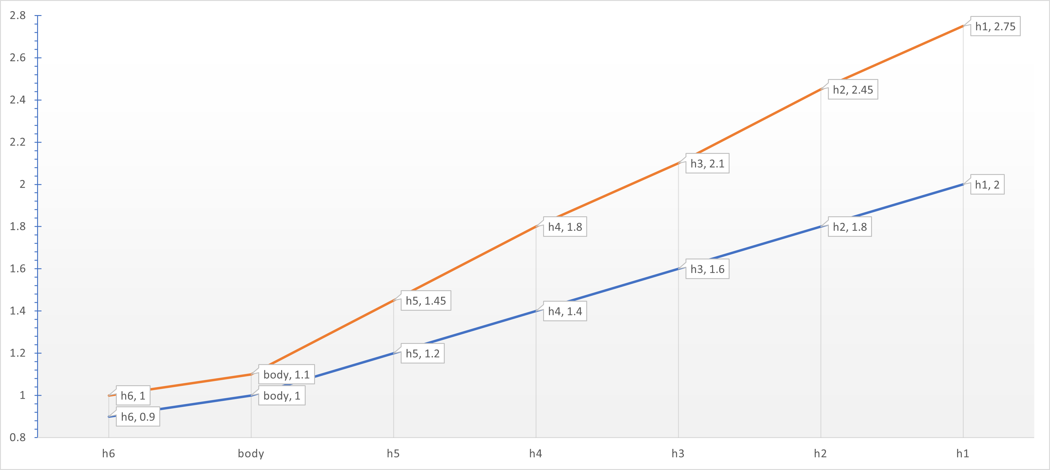
To calculate the minimum and maximums across a whole body/heading suite of sizes, I find it best to determine <body> and <h1> then use Excel to fill in the <h2> to <h5> values using the fill series feature to create a linear progression between the two sizes. I treat <h6> as a subscript size separately.
Example Minimum/Maximum Font Sizes
| Font Element | h6 | body | h5 | h4 | h3 | h2 | h1 |
|---|---|---|---|---|---|---|---|
| Minimum | 0.90 | 1.00 | 1.20 | 1.40 | 1.60 | 1.80 | 2.00 |
| Maximum | 1.00 | 1.10 | 1.45 | 1.80 | 2.10 | 2.45 | 2.75 |
Font sizes in rem
This gives me a set of font sizes that looks like the following:
Our goal now is to create a set of clamp declarations for each text element that will return a font size either on, or between, the minimum and maximum value depending on the width of the viewport.
Calculating the Clamp Preferred Size
If this is getting a bit too mathsy, or just TMI, you can skip directly to the calculator tool below.
Step 1: Determine Minimum & Maximum Font Sizes and Viewports
We should know our minimum and maximum font sizes by now, as determined above.
- The minimum viewport I normally take to be 380px, an arbitrary figure for a small mobile.
- For maximum, it really depends on your site design and more. For this site, as mentioned above, the content column grows to a maximum of 130rem (normally 2080px). After that, the remainder is white space to either side.
- This in itself is arbitrary. You can set your minimum and maximum width at any point suitable for your website, it doesn't need to be the viewport range that your site will be viewed at. For this exercise, I'll use 1800px for the widest viewport I want the font to be variable over.
Step 2: Convert Font Sizes and Widths to rem
Why use rem? That's a long discussion, but well explained here. In short, the standard browser setting uses 16px/rem. The vast majority of visitors will have this. However, anyone with visual impairment for example might have this set higher to 20px/rem or more, or perhaps it's a quirk of the device being used. Specifying font by pixels will display the font at the same size no matter what, whereas rem will scale according to browser setting.
Why use rem and not em? The problem with em is that it uses the parent element's font-size, so you can end up in all sorts of mess. Use rem for consistency.
In the example below, I'll assume 16px per rem. The calculator tool below will read your browser setting.
Warning
If the rem-to-pixel ratio is changed in the browser while viewing your site, the page will need reloading, it will not resize in response to this change. Listening for this event would take an unreasonable amount of overhead for the remote chance that this happens.
Step 3: Determine the Formula for the Preferred Font Size
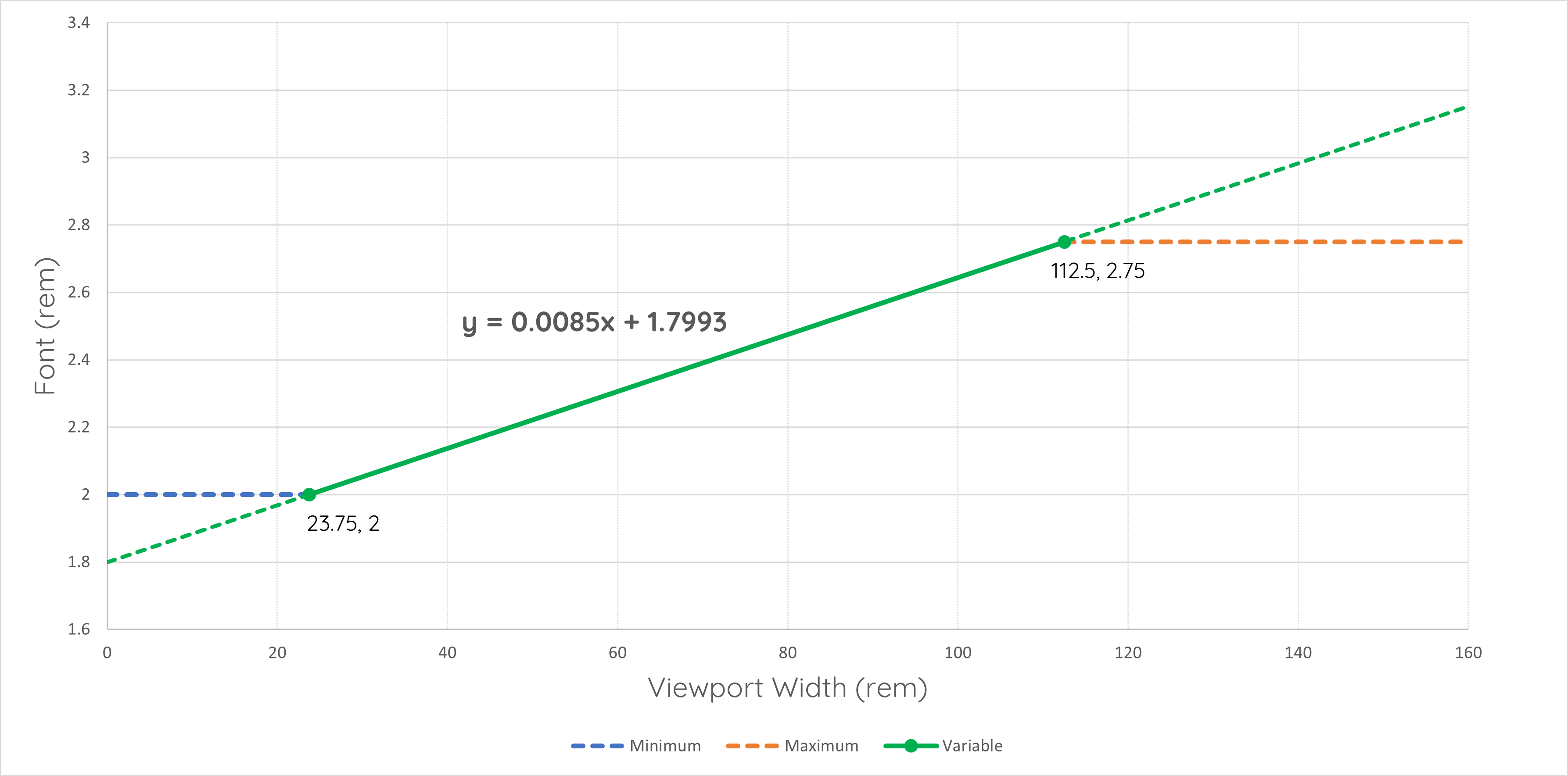
With our values for minimum and maximum font and viewport sizes, we can plot these on a graph and determine slope and intercept. With that, using linear interpolation, we can determine preferred font size for any viewport width. To do this, we need to calculate slope and y-intercept (the hypothetical font size if we had a zero-width viewport).
Taking our <h1> example from above, our minimum font size is 2rem @ 380pixels \((380/16 = 23.75rem)\) and 2.75rem @ 1800pixels \((1800/16 = 112.5rem)\)
The slope is given by:
\[slope=\frac{\left({\rm FontSize}_{max}\ -\ {\rm FontSize}_{min}\right)}{\left({\rm Width}_{max}\ -\ {\rm Width}_{min}\right)}\]\[=\frac{(2.75-2)}{(112.5-23.75)}=0.0085\]
The y-intercept is given by:
\[y_{intercept}={\rm FontSize}_{min}-\left({\rm Width}_{min}\times slope\right)\]\[=\ 2-\left(23.75\times0.0085\right)=\ 1.799\]
Plotting this on a graph, we can visualise this and confirm our calculations are correct:
Step 4: Create the Font Size clamp() Function
Because viewport vw is described as a percentage, we need to multiply the slope by 100 to achieve our clamp function:
\[{\rm FontSize}_{preferred}=y_{intercept}+\left(slope\times100\right)vw\]\[=1.799rem+0.85vw\]
So our <h1> definition becomes:
.h1, h1 {
  font-size: clamp(2rem, 1.799rem + 0.85vw, 2.75rem);
}
Variable Font Size Clamp Calculator
The good news is that you don't need to fiddle about with all that calculating each time. Use the handy tool below to instantly visualise your minimum, preferred and maximum font sizes and get the ready made clamp formula to paste into your CSS.
Viewport Width
Select Viewport Width Range to Scale Font Over (pixels)
Font Size
Select Font Size Range Minimum and Maximum (rem)
Rendered Font Sizes - rendered at
Minimum Font Size
Dynamic Font Size
Maximum Font Size
CSS Code (Click code to copy)
font-size: clamp
Using root Variables to Declare Font Sizes
It's really better practice to declare your font families and sizes as variables in the root of your css then reference those everywhere else. This way, you're only ever setting them once and any changes are reflected throughout your site.
For example the root, and subsequent <body> definition, for this site is defined as:
:root {
  --font-family-headings: "Quicksand", sans-serif;
  --font-family-body: "Work Sans", sans-serif;
  --font-family-monospace: "Roboto Mono", "Courier New", monospace;
  --font-size-1: clamp(2rem, 1.7993rem + 0.8451vw, 2.75rem);
  --font-size-2: clamp(1.8rem, 1.6261rem + 0.7324vw, 2.45rem);
  --font-size-3: clamp(1.6rem, 1.4662rem + 0.5634vw, 2.1rem);
  --font-size-4: clamp(1.4rem, 1.293rem + 0.4507vw, 1.8rem);
  --font-size-5: clamp(1.2rem, 1.1331rem + 0.2817vw, 1.45rem);
  --font-size-6: clamp(0.9rem, 0.8732rem + 0.1127vw, 1rem);
  --font-size-body: clamp(1rem, 0.9599rem + 0.169vw, 1.15rem);
}
body {
  margin: 0;
  font-family: var(--font-family-body);
  font-size: var(--font-size-body);
  font-optical-sizing: auto;
  font-weight: 400;
  line-height: 1.5;
}
Font Optical Sizing
The CSS property font-optical-sizing controls the use of alternative glyphs in a font that are designed to improve legibility at certain sizes. When set to auto, the browser will determine whether to enable optical sizing based on factors such as the font size and rendering environment.
Here's what happens with font-optical-sizing: auto;:
- Browser Determination: The browser will decide whether to enable optical sizing for the font based on various factors such as the font size and the rendering environment.
- Use of Alternative Glyphs: If the browser determines that optical sizing is appropriate, it may use alternative glyphs from the font that are designed specifically to improve legibility at the given size.
- Improved Legibility: The use of these alternative glyphs can result in improved legibility of text at certain font sizes, making characters clearer and easier to read.
- Fallback: If optical sizing is not supported by the font or by the browser, or if the browser decides not to enable it, the regular glyphs will be used instead, and there will be no special effect from the
font-optical-sizingproperty.
In summary, font-optical-sizing: auto; allows the browser to determine whether to use optical sizing for improved legibility of text based on the font size and rendering environment.
Conclusion
This article has shown how to use the CSS clamp() function to create responsive font sizes that scale linearly with the viewport, without the need for media queries or complex calculations.
The clamp() function allows us to specify a minimum, a preferred, and a maximum value for any CSS property, such as font-size, width, height, and more. By using clamp() with variable fonts, we can achieve smooth and consistent typography across different screen sizes and devices.
The article also provided a handy tool to help you generate your own clamp() values based on your desired minimum and maximum font sizes and viewport widths. You can use this tool to experiment with different combinations and see the results in real-time.
Finally, we touched on the use of font-optical-sizing: auto; to use optical sizing for improved legibility of your variable fonts.
Hopefully you found this article useful and learned something new about CSS and responsive design. If you have any questions or feedback, please feel free to leave a comment below. Thanks for reading!
Although this article concentrated on font sizes, you could easily use the same technique for <div>, <image>, padding, margins and more. The only difference in the calculation methodology is that you may need to use pixels rather than rem on those objects that require an absolute dimension that pixels give us.