Tech Blog
Here I'll be sharing insights from my professional experiences and studies in data science and web development. There'll be plenty of Wagtail, Django and Python, a bit of JavaScript and CSS thrown in, and more on data science & engineering. There might even be a bit of time for some project management and business analysis too.
I'll also provide insights into how this site was made, as well as code examples and thoughts on how those could be further developed.
Feel free to leave questions or comments at the bottom of each post - I just ask people to create an account to filter out the spammers. You won't receive any unsolicited communication or find your email sold to a marketing list.
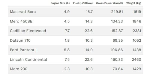
Better Looking Tables with kable in Your R Markdown Documents
If you're using knitr with R markdown documents, you've probably come across the ubiquitous Xtable to display your dataframes and had to wrestle with either LaTeX or css to get the tables displaying with any sense of readability. The kable package comes with a lot of easy to use features including bootstrap styling to make life much easier.
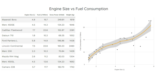
Adding Multi-column Formats to R Markdown Documents
It's possible to insert script tags inside raw HTML blocks and run your R code from there, but this is kind of nasty and takes the code out of the runnable framework, which is not a good idea where variables are being created/modified and used later on.
R Markdown supports some basic HTML elements. It also has its own notation for the <div> tag using the triple colon notation ::: for both opening and closing the element and, unlike using <div>, knitr won't auto-close these.
Learn how to use this and create a bootstrap responsive multi-column output directly from knitr.
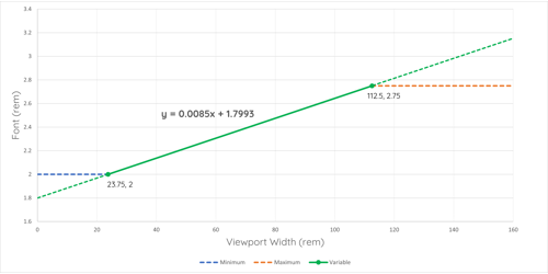
Creating Responsive Font Sizes Based on the Viewport
Previously, responsive typography required a series of media queries, font definitions, and other complexities. All of that has changed thanks to widespread browser support for variable fonts and the all-important CSS clamp() function.
I'll show you how to linearly scale text between a set of minimum and maximum sizes when the width of the viewport changes, with the goal of making its behaviour at different screen sizes more predictable without the use of media queries and with only one line of CSS. Use the on-screen calculator to build your font sizes.
I'll show you how to linearly scale text between a set of minimum and maximum sizes when the width of the viewport changes, with the goal of making its behaviour at different screen sizes more predictable without the use of media queries and with only one line of CSS. Use the on-screen calculator to build your font sizes.
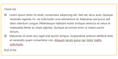
Wagtail: Extending the Draftail Editor Part 4 - Custom Lists
The fourth part of this series looks at creating custom lists in Draftail, including the limitations considering this is not currently a supported feature in the editor.
I'll show how to create custom list styles within those limitations, and also how you can use a custom list to apply styling around a group of consecutive blocks of the same type.
I'll show how to create custom list styles within those limitations, and also how you can use a custom list to apply styling around a group of consecutive blocks of the same type.
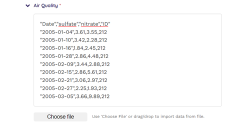
Importing Text From File Into a textarea HTML Form Field
This article covers how to add the ability to read the contents of a text file into a textarea form field from the front end without need to upload anything to the server. We'll go through adding a file input button with file type filter, enabling drag/drop and setting up the necessary JavaScript to handle both events.
We'll tie this together by creating a custom FieldPanel in Wagtail's CMS and add some CSS to tidy things up.
We'll tie this together by creating a custom FieldPanel in Wagtail's CMS and add some CSS to tidy things up.

Creating Wagtail Streamfield StructBlocks with a Customised Editor Interface
This article will take you through the process of creating custom Wagtail Streamfield StructBlocks. You will learn how to customize the editing interface with CSS and JavaScript to achieve responsive front-end behaviour.
I'll demonstrate the creation of a StructBlockAdapter and the registration of JavaScript using Telepath. Additionally, I'll give a real-world example, showing how to include a custom StructBlock as a component of a parent StructBlock.
I'll demonstrate the creation of a StructBlockAdapter and the registration of JavaScript using Telepath. Additionally, I'll give a real-world example, showing how to include a custom StructBlock as a component of a parent StructBlock.
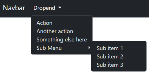
Unlocking Enhanced Navigation with Bootstrap: A Guide to Submenus in Dropdown Menus
Bootstrap has a notable feature gap: it doesn't provide a native component for nesting dropdown buttons. In this article, we'll delve into the art of crafting submenus within Bootstrap dropdown menus. You'll gain insights into seamlessly incorporating them into navbar dropdown menus, handling both collapsed and expanded views. Elevate your web navigation with Bootstrap submenus!
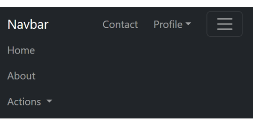
Crafting a Bootstrap Navbar: How to Create Sticky Items for Persistent Visibility in Collapsed Mode
Explore the art of designing a Bootstrap navbar that goes beyond conventional boundaries. In this guide, discover the secrets to creating sticky items that remain visible even in collapsed mode. Elevate your web design with seamless navigation that ensures key elements are always at your users' fingertips.
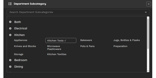
Efficient Cascading Choices in Wagtail Admin: A Smart Chooser Panel Solution
In the Wagtail admin interface, handling cascading or dependent selections can be a challenge due to the absence of active controls. This tutorial unveils a practical solution by guiding you through the creation of a custom 'chooser' panel. This panel not only elegantly displays dependent elements grouped by their parent element, focusing on categories and subcategories, but also incorporates an intuitive partial match filter for swift and efficient selections.
Learn how to implement this custom chooser panel, providing a one-click method to effortlessly manage cascading selections, enhancing your Wagtail experience.
Learn how to implement this custom chooser panel, providing a one-click method to effortlessly manage cascading selections, enhancing your Wagtail experience.
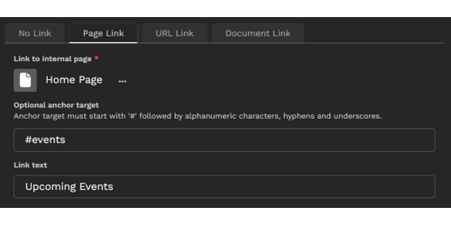
Build an Intuitive Link StructBlock in Wagtail: Simplifying Link Management for Content Editors
Learn how to create a reusable StructBlock in Wagtail that simplifies the management of different link types.
Develop an intuitive, compact, and interactive tabbed interface that empowers content editors to seamlessly select link type, path, and text, all while optimizing page space within the editing interface. Implement a common method to retrieve URL and text for the link regardless of link type, including custom link types.
We'll cover concepts essential for achieving our goal, such as transforming Django's radio select widget into a tab group, constructing an interactive panel interface within the StructBlock using a custom Telepath class, dynamically adding child blocks based on initial parameters, integrating data attributes into block forms, custom StructValue classes and designing adaptable choice blocks.

Creating Conditional Logic in CSS
There are times that the ability to use conditional statements in CSS would be really handy. CSS lacks any if/else type clauses to enable this, but there is the possibility to arrive at a binary value by combining calc with min & max statements and use the outcome of that to 'decide' what rule to apply.

Loading CSS and Javascript On Demand in a CMS Environment
In modern web development, particularly within a CMS environment, the efficiency of resource management is paramount. Loading JavaScript and CSS libraries only when they are associated with a specific block or component offers significant advantages. This approach not only enhances performance by reducing the overall page load time but also optimises the user experience by minimising unnecessary code execution.
This article demonstrates one strategy for implementing on-demand loading of JavaScript and CSS in a CMS context, thereby enhancing performance and maintainability.
This article demonstrates one strategy for implementing on-demand loading of JavaScript and CSS in a CMS context, thereby enhancing performance and maintainability.
