
Crafting a Bootstrap Navbar: How to Create Sticky Items for Persistent Visibility in Collapsed Mode
Introduction
Navigating the digital landscape involves adapting to various screen sizes, especially in the era of mobile-first design. While collapsing a navbar for smaller screens is a common practice, there are instances where certain links deserve to be in the spotlight, even in the collapsed mode. Imagine a user trying to make a swift purchase or contact your business – having essential links like the shopping cart, book now, or contact readily available can be the difference between a lost opportunity and a successful conversion.
In the realm of Bootstrap, the go-to framework for responsive web development, creating a navbar that seamlessly accommodates sticky items in both collapsed and expanded modes may seem like a hidden art. What many developers might not know is that Bootstrap toggler button is capable of targeting multiple items by setting a classname for the data-bs-target attribute.
This revelation opens up a world of possibilities. By harnessing this feature along with a touch of custom CSS, we can fashion a navbar that not only collapses gracefully but also ensures that vital links stay visible even when the rest of the menu is tucked away.
In this tutorial, we'll go through the step-by-step crafting such a navbar. We'll explore the nuances, tackle potential pitfalls, and guide you through the process of overcoming Bootstrap's default styling to achieve a harmonious blend of functionality and aesthetics.
This article assumes you are using Bootstrap 5.2 or later. Not all features discussed here, or code used in the demo navbar, were available on earlier versions.
You should be familiar with the concepts described in the Bootstrap NavBar Responsive Behaviours documentation before reading this article.
To view the responsive behaviour of the demo navbar used in this article, you will need a screen size of at least 700x500px.
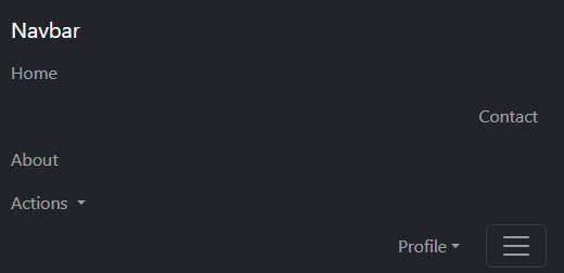
The Basic Collapsible NavBar Element
Our starting point will be a basic NavBar more or less straight from the Bootstrap documentation with three basic links and two dropdown menus.
<nav class="navbar navbar-expand-sm bg-dark tutorial" data-bs-theme="dark" id="navbarStickyItemsDemo">
    <div class="container-fluid justify-content-end w-100">
        <a class="navbar-brand me-auto">Navbar</a>
        <button class="navbar-toggler"
                id="navbar-toggler"
                type="button"
                data-bs-toggle="collapse"
                data-bs-target="#navbarCollapseItems"
                aria-controls="navbarStickyItemsDemo"
                aria-expanded="false"
                aria-label="Toggle navigation"
                onclick="this.blur()">
            <span class="navbar-toggler-icon"></span>
        </button>
        <div class="collapse navbar-collapse" id="navbarCollapseItems">
            <ul class="navbar-nav">
                <li class="nav-item"><a class="nav-link">Home</a></li>
                <li class="nav-item"><a class="nav-link">Contact</a></li>
                <li class="nav-item"><a class="nav-link">About</a></li>
                <li class="nav-item dropdown">
                    <button class="nav-link dropdown-toggle" data-bs-toggle="dropdown" aria-expanded="false">
                        Actions
                    </button>
                    <ul class="dropdown-menu">
                        <li><a class="dropdown-item">Action</a></li>
                        <li><a class="dropdown-item">Another action</a></li>
                        <li><hr class="dropdown-divider"></li>
                        <li><a class="dropdown-item">Something else here</a></li>
                    </ul>
                </li>
                <li class="nav-item dropdown">
                    <button class="nav-link dropdown-toggle" data-bs-toggle="dropdown" aria-expanded="false">
                        Profile
                    </button>
                    <ul class="dropdown-menu dropdown-menu-end"
                        aria-labelledby="navbarDropdown">
                        <li><a class="dropdown-item">Set Password</a></li>
                        <li><a class="dropdown-item">Edit Profile</a></li>
                        <li><hr class="dropdown-divider"></li>
                        <li><a class="dropdown-item">Logout</a></li>
                    </ul>
                </li>
            </ul>
        </div>
    </div>
</nav>- The nav items are all grouped together in a single
navbar-navlist, the navbar toggler button targets the parent container of that list by its ID (data-bs-target="#navbarCollapseItems"). - The NavBar uses the Bootstrap
sm(576px) breakpoint to trigger the expanded view. - The items are aligned to the right in expanded mode.
- All menu items are hidden and moved to the mobile menu in collapsed mode.
This gives us the following menu.
Use the resize grip in the bottom right corner to adjust the frame width and activate the responsive behaviour.
Enabling Sticky Items
Using our example above, our goal will be to make the Contact link and Profile sub-menu sticky so that they remain visible on the menu in collapsed mode.
Breaking up the nav items
Displaying a mix of sticky and collapsible items requires setting the order of elements dependent on screen size.
Our first step in this is breaking the items out of a singular navbar-nav list, and creating a containerised list for each item.
Instead of a <div> container with class="collapse navbar-collapse", our sticky items will have a custom class="sticky-menu-item" which we will define later in the article.
Where, above, we had:
<div class="collapse navbar-collapse">
    <ul class="navbar-nav">
        <li class="nav-item"><a class="nav-link">Home</a></li>
        <li class="nav-item"><a class="nav-link">Contact</a></li>
        <li class="nav-item"><a class="nav-link">About</a></li>
        ....
    </ul>
</div>
we need to convert this to:
<div class="collapse navbar-collapse">
    <ul class="navbar-nav">
        <li class="nav-item"><a class="nav-link">Home</a></li>
    </ul>
</div>
<div class="sticky-menu-item">
    <ul class="navbar-nav">
        <li class="nav-item"><a class="nav-link">Contact</a></li>
    </ul>
</div>
<div class="collapse navbar-collapse">
    <ul class="navbar-nav">
        <li class="nav-item"><a class="nav-link">About</a></li>
    </ul>
</div>
....
If we were to view this now, we'd see that the items were now spread across all available horizontal space. This is due to the default Bootstrap style which sets navbar-collapse items flex-grow attribute to 1.
/* Bootstrap styling (_navbar.scss) */
.navbar-collapse {
    flex-basis: 100%;
    flex-grow: 1;
    align-items: center;
}
We'll turn this off with flex-grow: 0!important; when we come to styling later.
One more styling catch - nav-link elements have a horizontal padding in expanded mode but not in collapsed mode. This is set via the following Bootstrap rule for the sm breakpoint:
@media (min-width: 576px)
.navbar-expand-sm .navbar-nav .nav-link {
    padding-right: var(--bs-navbar-nav-link-padding-x);
    padding-left: var(--bs-navbar-nav-link-padding-x);
}
To maintain a constant padding for our sticky nav items, we'll apply those padding values at all screen sizes:
.sticky-menu-item .nav-link {
    padding-right: var(--bs-navbar-nav-link-padding-x);
    padding-left: var(--bs-navbar-nav-link-padding-x);
}
Targeting Multiple Collapsible Containers
In our default code above, the toggler buttons targets a single navbar-collapse element by ID with data-bs-target="#navbarCollapseItems".
Oddly, what the Bootstrap documentation doesn't show, is that this target value is a css selector string. It will in fact target all elements that match the selector. So rather than using a unique ID which limits you to one element, you can use a CSS class for example and include all elements with that class.
For our case, we'll use data-bs-target=".navbar-collapse" to target all of our collapsible containers with navbar-collapse in their class list.
Since it is a selector, be sure to include the '.' before the class name in the target definition (similarly, '#' denotes an ID in selector notation).
Our collapsed view now displays the sticky items:

Maintaining Item Order
Without adjusting the default order on the nav items, after clicking on the toggler button, we would see the following mess displayed on the mobile menu:
Above the breakpoint (expanded view), all items appear before the toggler button. In collapsed view, sticky items need to appear before the toggler, while collapsible items need to appear afterwards.
We'll make use of the css order attribute to to achieve this. We can make use of the fact that elements with the same order rank will just appear in the same order that they appear in the code - there is no need to assign a unique order rank to each element.
- In expanded view, all nav items will have order 0.
- In collapsed view, sticky items will retain order 0 while all collapsible items will have order 2.
- The toggler button will have order 1 (which we will apply directly with the Bootstrap
order-1class).
div.navbar-collapse {
    order: 2!important;
}
@media (min-width: 576px) {
    .navbar-expand-sm div.navbar-collapse {
        flex-grow: 0!important;
        order: 0!important;
    }
}
.sticky-menu-item {
    order: 0;
}
Remember to change the-smsuffix andmin-widthfor other breakpoints.
Handling Sticky Dropdown Menus
There are a couple of extra steps to take to deal with dropdown menus.
Styling
Above the breakpoint, Bootstrap sets the position attribute of dropdown-menu elements to absolute, while below the breakpoint it is set to static:
/* _navbar.scss */
.navbar-nav .dropdown-menu {
    position: static;
}
@media (min-width: 576px)
.navbar-expand-sm .navbar-nav .dropdown-menu {
    position: absolute;
}
Position static allows the submenus to expand inline in the mobile view.
With our sticky dropdown menus, trying to expand those with position static will result in the following display:
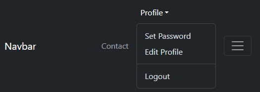
The dropdown menu is confined to the boundaries of the NavBar, pushing the height of the NavBar out when expanded.
Obviously not what what we want, but easily remedied by setting the display property with some additional css:
.sticky-menu-item .dropdown-menu {
    position: absolute;
}
Collapsing the mobile menu if expanded
If you expand the mobile menu with the toggler button then click on the sticky dropdown menu, both will be expanded at the same time:
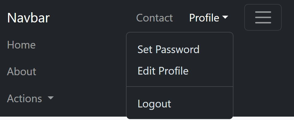
This is not essential, but to give a more complete experience, we want the mobile menu to be dismissed if the sticky dropdown is shown.
We can check the state of the mobile menu by looking at the aria-expanded attribute of the toggler button. If set to true, we can use a small script raise a click event for the toggler button to collapse it again.
const handleDropdownShow = (event) => {
    const navbar = event.target.closest('nav.navbar');
    const navbarToggler = navbar.querySelector("button.navbar-toggler");
    if (navbarToggler.getAttribute("aria-expanded") === "true" &&
        event.target.closest('div.sticky li.nav-item.dropdown') &&
        navbarToggler) {
        navbarToggler.click();
    }
}

document.addEventListener('DOMContentLoaded', () => {
    const navbar = document.getElementById("navbarStickyItemsDemo");
    navbar.addEventListener("show.bs.dropdown", handleDropdownShow);
}- Add a listener to navbar for the Bootstrap 'show dropdown' event (
show.bs.dropdown) which calls a customhandleDropdownShowmethod. - This method looks to see if the clicked item is a sticky menu (or child of), and if the "mobile" menu is expanded (by examining the
aria-expandedattribute of the toggle button). If so, raise theclickevent for that toggler button which causes the mobile menu to collapse.
Putting It All Together
Now, you've got a navbar that not only collapses gracefully but also keeps your essential links in check.
The complete code and working example is listed below.
CSS
.navbar-nav {
    margin-right: 0.25rem;
}
div.navbar-collapse {
    order: 2!important;
}
@media (min-width: 576px) {
    .navbar-expand-sm div.navbar-collapse {
        flex-grow: 0!important;
        order: 0!important;
    }
}
.sticky-menu-item {
    order: 0;
}
.sticky-menu-item .nav-link {
    padding-right: var(--bs-navbar-nav-link-padding-x);
    padding-left: var(--bs-navbar-nav-link-padding-x);
}
.sticky-menu-item .dropdown-menu {
    position: absolute;
}
HTML
<nav class="navbar navbar-expand-sm bg-dark tutorial" data-bs-theme="dark" id="navbarStickyItemsDemo">
    <div class="container-fluid justify-content-end w-100">
        <a class="navbar-brand me-auto">Navbar</a>
        <button class="navbar-toggler order-1"
                id="navbar-toggler"
                type="button"
                data-bs-toggle="collapse"
                data-bs-target=".navbar-collapse"
                aria-controls="navbarStickyItemsDemo"
                aria-expanded="false"
                aria-label="Toggle navigation"
                onclick="this.blur()">
            <span class="navbar-toggler-icon"></span>
        </button>
        <div class="collapse navbar-collapse">
            <ul class="navbar-nav">
                <li class="nav-item"><a class="nav-link">Home</a></li>
            </ul>
        </div>
        <div class="sticky-menu-item">
            <ul class="navbar-nav">
                <li class="nav-item"><a class="nav-link">Contact</a></li>
            </ul>
        </div>
        <div class="collapse navbar-collapse">
            <ul class="navbar-nav">
                <li class="nav-item"><a class="nav-link">About</a></li>
            </ul>
        </div>
        <div class="collapse navbar-collapse">
            <ul class="navbar-nav">
                <li class="nav-item dropdown">
                    <button class="nav-link dropdown-toggle" data-bs-toggle="dropdown" aria-expanded="false">
                        Actions
                    </button>
                    <ul class="dropdown-menu">
                        <li><a class="dropdown-item">Action</a></li>
                        <li><a class="dropdown-item">Another action</a></li>
                        <li><hr class="dropdown-divider"></li>
                        <li><a class="dropdown-item">Something else here</a></li>
                    </ul>
                </li>
            </ul>
        </div>
        <div class="sticky-menu-item">
            <ul class="navbar-nav">
                <li class="nav-item dropdown">
                    <button class="nav-link dropdown-toggle" data-bs-toggle="dropdown" aria-expanded="false">
                        Profile
                    </button>
                    <ul class="dropdown-menu dropdown-menu-end">
                        <li><a class="dropdown-item">Set Password</a></li>
                        <li><a class="dropdown-item">Edit Profile</a></li>
                        <li><hr class="dropdown-divider"></li>
                        <li><a class="dropdown-item">Logout</a></li>
                    </ul>
                </li>
            </ul>
        </div>
    </div>
</nav>
JavaScript
const handleDropdownShow = (event) => {
    const navbar = event.target.closest('nav.navbar');
    const navbarToggler = navbar.querySelector("button.navbar-toggler");
    if (navbarToggler.getAttribute("aria-expanded") === "true" &&
        event.target.closest('div.sticky li.nav-item.dropdown') &&
        navbarToggler) {
        navbarToggler.click();
    }
}

document.addEventListener('DOMContentLoaded', () => {
    const navbar = document.getElementById("navbarStickyItemsDemo");
    navbar.addEventListener("show.bs.dropdown", handleDropdownShow);
}
Working Example
Below is a working model of the code above.
Use the resize grip in the bottom right corner to adjust the frame width and activate the responsive behaviour.
- Decrease the width of the panel to trigger the collapsed mode and see the sticky items remaining on the visible portion of the NavBar.
- Increase the width again and note the order of items is restored once again.
- With the menu in collapsed mode, expand the mobile menu with the toggler button. Click on the Profile sticky dropdown and note the mobile menu collapses again while leaving the sticky dropdown expanded.
Conclusion
In this article about the Bootstrap navbar, we've achieved a functional navigational solution for creating sticky items on a collapsed menu. Let's summarise the key steps and takeaways:
- We began with a standard Bootstrap navbar, establishing the foundation for our transformation. Our objective was to ensure specific links remained visible even in collapsed mode.
- Links were separated into individual containerised lists, each with a class list depending on whether the item would be collapsible or sticky.
- Leveraging the toggler button's ability to target multiple elements, we utilised class selectors for flexibility.
- CSS order attributes were employed to establish a visually coherent layout, crucial for both expanded and collapsed views.
- Styling adjustments, coupled with JavaScript, addressed nuances in dropdown behaviour, providing a polished user experience.
In conclusion, our refined navbar seamlessly collapses while retaining essential links, demonstrating the versatility of Bootstrap. Key takeaways include leveraging toggler button capabilities, utilising custom classes for structural control, and employing styling tweaks for optimal user interaction.
If you found this article helpful, you might also enjoy the previous article on creating nested submenus for Bootstrap NavBars.