
Unlocking Enhanced Navigation with Bootstrap: A Guide to Submenus in Dropdown Menus
Introduction
Bootstrap is a powerful web framework that offers many features, but one thing it does not have is a native component for creating nested dropdown buttons. This can be a problem if you want to add submenus to your dropdown menus in the navbar.
In this article, I'll show you how to create submenus within Bootstrap dropdown menus using some tricks and techniques. You'll learn how to use the dropstart and dropend button types, which are not designed for submenus, but can be adapted with some adjustments. At the end, you'll create a new type of submenu to display the contents inline in the style of an accordion button.
You'll also learn how to style and display the submenus in both collapsed and expanded views.
By the end of this article, you will be able to enhance your web navigation with Bootstrap submenus!
Note
This article displays Bootstrap components in both collapsed and expanded mode regardless of screen size. Display of expanded components could be problematic on mobile screens.
Bootstrap Dropdown Components
Dropdown Buttons
Bootstrap provides a range of Dropdown buttons, which allow you to create pop-out menus with ease. These menus can pop out in different directions - up, down, left, or right (start or end). The direction adapts to the available screen space automatically, ensuring a smooth user experience.
These options also adjust to the screen space, maintaining a functional design.
To turn off the dynamic display behaviour, just add data-bs-display="static" to the button.
Code for the buttons above (click to expand):
<div class="btn-group">
    <button class="btn btn-light dropdown-toggle" type="button" data-bs-toggle="dropdown" aria-expanded="false">
        Single Dropdown
    </button>
    <ul class="dropdown-menu">
        <li><a class="dropdown-item">Action</a></li>
        <li><a class="dropdown-item">Another action</a></li>
        <li><a class="dropdown-item">Something else here</a></li>
    </ul>
</div>
<div class="btn-group">
    <button type="button" class="btn btn-light">Split Dropdown</button>
    <button type="button" class="btn btn-light dropdown-toggle dropdown-toggle-split" data-bs-toggle="dropdown"
        aria-expanded="false">
        <span class="visually-hidden">Toggle Dropdown</span>
    </button>
    <ul class="dropdown-menu">
        <li><a class="dropdown-item">Action</a></li>
        <li><a class="dropdown-item">Another action</a></li>
        <li><a class="dropdown-item">Something else here</a></li>
        <li>
            <hr class="dropdown-divider">
        </li>
        <li><a class="dropdown-item">Separated link</a></li>
    </ul>
</div>
<div class="btn-group">
    <button type="button" class="btn btn-light dropdown-toggle" data-bs-toggle="dropdown" data-bs-display="static"
        aria-expanded="false">
        Right-aligned
    </button>
    <ul class="dropdown-menu dropdown-menu-end">
        <li><button class="dropdown-item" type="button">Action</button></li>
        <li><button class="dropdown-item" type="button">Another action</button></li>
        <li><button class="dropdown-item" type="button">Something else here</button></li>
    </ul>
</div>
<div class="btn-group dropend">
    <button type="button" class="btn btn-light dropdown-toggle" data-bs-toggle="dropdown" aria-expanded="false">
        Dropend
    </button>
    <ul class="dropdown-menu">
        <li><a class="dropdown-item">Action</a></li>
        <li><a class="dropdown-item">Another action</a></li>
        <li><a class="dropdown-item">Something else here</a></li>
        <li>
            <hr class="dropdown-divider">
        </li>
        <li><a class="dropdown-item">Separated link</a></li>
    </ul>
</div>
<div class="btn-group dropstart">
    <button type="button" class="btn btn-light dropdown-toggle" data-bs-toggle="dropdown" aria-expanded="false">
        Dropstart
    </button>
    <ul class="dropdown-menu">
        <li><a class="dropdown-item">Action</a></li>
        <li><a class="dropdown-item">Another action</a></li>
        <li><a class="dropdown-item">Something else here</a></li>
        <li>
            <hr class="dropdown-divider">
        </li>
        <li><a class="dropdown-item">Separated link</a></li>
    </ul>
</div>
Dropdown Navlinks
Before we create custom submenus, it helps to get an understanding of how the dropdown menu works.
Basic Dropdown Menu
- Dropdown nav-item: To a standard
nav-itemlist item element, the bootstrapdropdownclass is added. This class just sets thepositionattribute torelativeto allow the popout menu to be positioned relative to the dropdown button. - Trigger Element: In a basic dropdown menu, you have a single
nav-linkthat triggers the dropdown. The link gets thedropdown-toggleclass to style the link as a button with dropdown arrow and theroleattribute set to"button". An additional attribute is added (data-bs-toggle="dropdown") for JS Popper to provide the popout menu action. There is also anaria-expandedattribute (true when the menu is expanded, false when hidden) added for screen readers. - Dropdown Menu: When you click on the trigger link, a list of options appears below it as a popout menu. These options are added to the dropdown nav-item as an unordered list of items (
<ul>). In effect, it's a nestednavbar-navelement with alternative styling and additional actions. The bootstrapdropdown-menuclass provides styling and positioning. An additionalshowclass is added when the menu is expanded to toggle visibility. - Dropdown Menu Items: The items in a dropdown menu are essentially
nav-itemanchor elements but styled withdropdown-itembootstrap class instead.
From this, we can see that the dropdown menu structure is a recursion of the navbar structure with some additional styling and actions applied. We'll use a similar technique to add submenus later on.
To use a dropdown in a navbar, the dropdown class is applied to the nav-item, while the button is changed to an anchor tag with role="button".
When collapsed, Bootstrap applies styling to show the dropdown menu as an expandable item in the list. The width of the dropdown menu displays full-width rather than fitting the content as it does in expanded view.
<nav class="navbar navbar-expand-md bg-body-tertiary">
    <div class="container-fluid">
        <a class="navbar-brand">Navbar</a>
        <button class="navbar-toggler" type="button" data-bs-toggle="collapse" data-bs-target="#navbar1"
            aria-controls="navbar1" aria-expanded="false" aria-label="Toggle navigation">
            <span class="navbar-toggler-icon"></span>
        </button>
        <div class="collapse navbar-collapse" id="navbar1">
            <ul class="navbar-nav me-auto mb-2 mb-lg-0">
                <li class="nav-item dropdown">
                    <button class="nav-link dropdown-toggle" role="button" data-bs-toggle="dropdown"
                        aria-expanded="false">
                        Dropdown
                    </button>
                    <ul class="dropdown-menu">
                        <li><a class="dropdown-item">Action</a></li>
                        <li><a class="dropdown-item">Another action</a></li>
                        <li>
                            <hr class="dropdown-divider">
                        </li>
                        <li><a class="dropdown-item">Something else here</a></li>
                    </ul>
                </li>
            </ul>
        </div>
    </div>
</nav>
Adding Sub-menus to Nav-link Dropdown Menus
Although Bootstrap documentation doesn't give any ready made components for this, we can make use of the dropend and dropstart components.
Dropend
We'll need to make some changes since our menu will appear in place of an unstyled list element:
- Dropdown container: The container is an unstyled list item element. The bootstrap
dropendclass is added here to style the style child trigger element. This is also the place we will add customsubmenuclasses to assist in styling for collapsed and expanded views. - Trigger Element: The only change we need to make from the dropdown trigger element is to change to bootstrap css class from
nav-linktodropdown-itemto keep it's styling consistent with other menu items. See note below regarding click behaviour. - Dropdown Menu & Menu Items: These are identical to dropdown menu equivalents and will just get some additional styling via the
submenuclass mentioned above.
We want the dropend button to open a link on click, however the dropdown menu will collapse when any child element is clicked by default. In order to stop this, we need to add onclick="event.stopPropagation();" to the button for now. Later, we will use a more robust solution when introducing multiple, nested submenus.
<ul class="navbar-nav">
    <li class="nav-item dropdown">
        <button class="nav-link dropdown-toggle" role="button"
            data-bs-toggle="dropdown" aria-expanded="false">
            Dropend
        </button>
        <ul class="dropdown-menu">
            <li><a class="dropdown-item">Action</a></li>
            <li><a class="dropdown-item">Another action</a></li>
            <li><a class="dropdown-item">Something else here</a></li>
            <li class="submenu submenu-md dropend">
                <button class="dropdown-item dropdown-toggle" role="button"
                    data-bs-toggle="dropdown" aria-expanded="false"
                    onclick="event.stopPropagation();">
                    Sub Menu
                </button>
                <ul class="dropdown-menu">
                    <li><a class="dropdown-item">Sub item 1</a></li>
                    <li><a class="dropdown-item">Sub item 2</a></li>
                    <li><a class="dropdown-item">Sub item 3</a></li>
                    <li>
                        <hr class="dropdown-divider">
                    </li>
                    <li><a class="dropdown-item">Sub item 4</a></li>
                </ul>
            </li>
        </ul>
    </li>
</ul> Note I've added a couple of custom classes submenu submenu-md to the list item element. We'll make use of this class below to style the collapsed and expanded views.Adding this submenu as a list item to the dropdown menu in the previous example, the expanded view appears mostly fine, but there's room for some styling improvements. We should raise the submenu to align the first item with the menu link, and overlap the left edge a little to provide better ownership context to the reader.
In the collapsed view, you'll notice that it displays a menu within a menu with nested borders. This can be a bit confusing to users and requires some adjustments for better clarity.
Styling
Collapsed View
For the collapsed view, to make the submenu items a little clearer to the reader with less clutter, we'll make the following changes:
- Remove the submenu border. Strip the default top padding and add extra to the bottom to allow extra space afterwards when expanded.
- Indent the submenu items.
- Add a transition to the
::afterpseudo-element to rotate it 90° so that it points down while the submenu is expanded. Bootstrap adds theshowclass to the button when the menu is expanded, we can use this in the selector to apply the styling.
li.submenu ul.dropdown-menu[data-bs-popper] {
    border-width: 0;
    padding-top: 0;
    padding-bottom: 1em;
}
li.submenu ul.dropdown-menu[data-bs-popper] li {
    padding-left: 1.5em;
}
li.submenu button.show::after {
    transform: rotate(90deg);
}I've left off using dropend in the selector as these styles are common to both dropend and dropstart in collapsed view. Some additional collapsed view styling will be needed for dropstart which we'll look at further on.
The collapsed dropend submenu with styles applied.
Expanded View
For the expanded view, we'll use submenu-md for the css selectors. Because some of the styles are specific in expanded view for dropstart and dropend, we'll use these classes as additional selectors where necessary.
Note
I'm only adding code for the medium md breakpoint (768px) here. The same styles apply for other breakpoints and can be combined via scss etc.
We need to make the following changes:
- Override the styles we added for the collapsed view to use default Bootstrap styles.
- Move the displayed submenu a little to the left and up for better UX.
- Move the pointer
::afterpseudo-element to the right hand of the button instead of immediately after the text. This is just to help the reader identify which menu items are submenus.
@media (min-width: 768px) {
    /* common styles */
    li.submenu-md ul.dropdown-menu[data-bs-popper] {
        border-width: var(--bs-dropdown-border-width);
        padding-top: var(--bs-dropdown-padding-y);
        padding-bottom: var(--bs-dropdown-padding-y);
        margin-top: -0.5em;
    }
    li.submenu-md ul.dropdown-menu[data-bs-popper] li {
        padding-left: var(--bs-dropdown-padding-x);
    }
    li.submenu-md button {
        display: inline-flex;
        align-items: center;
    }
    /* dropend styles */
    li.submenu-md.dropend ul.dropdown-menu[data-bs-popper] {
        margin-left: -0.3em;
    }
    li.submenu-md.dropend button.show::after {
        transform: unset;
    }
    li.submenu-md.dropend button::after {
        position: absolute;
        right: 0.4em;
    }
}The expanded dropend submenu with styles applied.
Dropstart
The dropstart element is useful when you have nav menus on the right hand end of your navbar. To use this, we just need to replace dropend with dropstart in the above code. Be sure to use dropdown-menu-end to align the dropdown with the right edge.
<ul class="navbar-nav">
    <li class="nav-item dropdown">
        <button class="nav-link dropdown-toggle"
            data-bs-toggle="dropdown" aria-expanded="false">
            Dropstart
        </button>
        <ul class="dropdown-menu dropdown-menu-end">
            <li><a class="dropdown-item">Action</a></li>
            <li><a class="dropdown-item">Another action</a></li>
            <li><a class="dropdown-item">Something else here</a></li>
            <li class="submenu submenu-md dropstart">
                <button class="dropdown-item dropdown-toggle"
                    data-bs-toggle="dropdown" aria-expanded="false"
                    onclick="event.stopPropagation();">
                    Sub Menu
                </button>
                <ul class="dropdown-menu">
                    <li><a class="dropdown-item">Sub item 1</a></li>
                    <li><a class="dropdown-item">Sub item 2</a></li>
                    <li><a class="dropdown-item">Sub item 3</a></li>
                    <li>
                        <hr class="dropdown-divider">
                    </li>
                    <li><a class="dropdown-item">Sub item 4</a></li>
                </ul>
            </li>
        </ul>
    </li>
</ul>
The unstyled dropstart submenu in collapsed and expanded view.
Styling
The dropstart class gives us some extra design considerations due to the ::before pseudo-element.
Collapsed View
The collapsed view styling should reflect the same as per the dropend class. For this, we need to hide the ::before pseudo-element and add the same ::after element that dropend uses. All other styles will be applied by the common classes we defined above for the dropend collapsed view.
li.submenu button::before {
    display: none;
}
li.submenu button::after {
    display: inline-block;
    margin-left: 0.255em;
    vertical-align: 0;
    content: "";
    border-top: 0.3em solid transparent;
    border-right: 0;
    border-bottom: 0.3em solid transparent;
    border-left: 0.3em solid;
}
The collapsed dropstart submenu with styling applied.
Expanded View
In the expanded view, we need to make the following adjustments:
- Hide the pointer
::afterelement and display the default::beforepointer instead. - Move the pointer
::beforepseudo-element into the left hand margin instead of immediately before the text. This will allow us to keep the left edge of the text aligned with otherdropdown-itemsin the menu. - Move the displayed submenu a little to the right and up for better UX.
To the common styles we defined in the dropend section above, we can add the following:
@media (min-width: 768px) {
    /* dropstart styles */
    li.submenu-md.dropstart button::after {
        display: none;
    }
    li.submenu-md.dropstart button::before {
        display: block;
        position: absolute;
        left: 0.4em;
    }
    li.submenu-md.dropstart ul.dropdown-menu[data-bs-popper] {
        margin-right: -0.3em;
    }
}
The expanded dropstart submenu with styling applied.
Dropinline
This class will give you an accordion style submenu that expands/collapses inline in expanded view just as menus and submenus do in collapsed view. This isn't a Bootstrap class, but I'm adding this for cases where you want to keep everything inline, especially useful when horizontal space is at a premium or for building vertical navs (see Vertical Nav section later).
Styling
Collapsed View
This is actually very easy to do with the css we have already defined. All that's needed is a change of styling on the dropdown menu in expanded view.
Expanded View
Most importantly, we change the position property from absolute to relative and force the width to 100% to contain it inside the parent dropdown menu. The rest is a little tidy up to remove any box-shadow and border and to set the background-color to transparent to show through the underlying parent background.
We want to keep the animated pointer ▸ that we defined earlier for the collapsed view as we are effectively performing the same collapse/expand menu action as we do there. Again, since this is defined for the collapsed (default) view, we don't need to specify anything for the expanded view.
Finally, the list items need a little indentation to provide some visual context.
@media (min-width: 768px) {
    /* dropinline styles */
    li.submenu-md.dropinline ul.dropdown-menu[data-bs-popper] {
        position: relative;
        width: 100% !important;
        border: 0;
        box-shadow: none;
        background-color: transparent;
    }
    li.submenu-md.dropinline ul.dropdown-menu[data-bs-popper] li {
        padding-left: 1em;
    }
}The expanded dropinline submenu with styling applied.
Enabling Auto-collapse on Submenus
Navbar dropdown menus will auto-collapse when another dropdown menu is clicked. This isn't the behaviour by default for our submenus. If you were to open one submenu then another on the same dropdown, you would see overlapping submenus similar to the following:
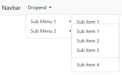
In our HTML so far, each dropdown toggle link in the submenu had a onclick listener defined that stopped propagation (preventing the dropdown menu from collapsing on click):
<button class="dropdown-item dropdown-toggle" role="button"
    data-bs-toggle="dropdown" aria-expanded="false"
    onclick="event.stopPropagation();">
    Sub Menu
</button>
We need to remove onclick="event.stopPropagation();" from each of these tags:
<button class="dropdown-item dropdown-toggle" role="button"
    data-bs-toggle="dropdown" aria-expanded="false">
    Sub Menu
</button>
Instead, we'll add a navbar click handler to listen for these events and include the stopPropagation() instruction there.
When a submenu is closed, the show class is removed from the dropdown toggler link and it's aria-expanded attribute is set to false (from true). Additionally, the show class is removed from the sibling ul.dropdown-menu element.
const autoCollapseSubmenu = (event) => {
    if (event.target.matches('li.submenu>button.dropdown-item.dropdown-toggle')) {
        // prevent parent dropdown menu from collapsing on click
        event.stopPropagation();
        // find parent navbar element
        const navbar = event.target.closest('nav.navbar');
        // get the target submenu (the ul.dropdown-menu sibling of the clicked item)
        targetSubmenu = event.target.parentElement.querySelector('ul.dropdown-menu');
        // find any open submenu items
        // set class and aria attributes to closed unless element is clicked element or direct ancestor
        if (targetSubmenu) {
            navbar.querySelectorAll('li.submenu>ul.dropdown-menu.show').forEach((subMenu) => {
                if (!subMenu.contains(targetSubmenu)) {
                    // dropdown toggle link - remove 'show' class, set aria-expanded to fale
                    subMenu.classList.remove('show');
                    // Get the sibling ul.dropdown-menu
                    const dropDownToggle = subMenu.parentElement.querySelector('button[aria-expanded="true"].dropdown-item.dropdown-toggle');
                    if (dropDownToggle) {
                        // Remove the 'show' class
                        dropDownToggle.classList.remove('show');
                        dropDownToggle.setAttribute('aria-expanded', 'false');
                    }
                }
            });
        };
    }
};

document.querySelectorAll('nav.navbar').forEach((navbar) => {
    navbar.addEventListener('click', autoCollapseSubmenu);
});- When opening or closing a submenu, the clicked item (
event.target) is a submenu dropdown-toggle link (li.submenu>button.dropdown-item.dropdown-toggle). - If the the
event.targetmatches this, get the target submenu element (always the sibling of the clicked item in this case). - Find any open submenu elements (
li.submenu>ul.dropdown-menu.show). - If any of those are not either the target submenu, or a direct ancestor of the target element (
!subMenu.contains(targetSubmenu)), 'close' the submenu by removing the show class from the submenu element and its sibling submenu dropdown-toggle link (also setaria-expanded=falseon the latter).
This will ensure any open submenu not in the direct chain of elements leading to the clicked submenu are closed.
Be sure to include this JavaScript in your HTML.
You can see this in action in the demonstration below.
tldr - The Complete Navbar Submenu Code
The complete css, navbar HTML & Javascript with dropstart, dropinline and dropend submenu types:
li.submenu ul.dropdown-menu[data-bs-popper] {
    border-width: 0;
    padding-top: 0;
    padding-bottom: 1em;
}

li.submenu ul.dropdown-menu[data-bs-popper] li {
    margin-left: 1.5em;
}

li.submenu>button.dropdown-toggle.show::after {
    transform: rotate(90deg);
}

li.submenu.dropinline>button.dropdown-toggle::after {
    transform: rotate(-90deg);
}

li.submenu.dropinline>button.dropdown-toggle.show::after{
    transform: rotate(0deg);
}

li.submenu.dropstart>button.dropdown-toggle::before {
    display: none;
}

li.submenu.dropstart>button.dropdown-toggle::after {
    display: inline-block;
    margin-left: 0.255em;
    vertical-align: 0;
    content: "";
    border-top: 0.3em solid transparent;
    border-right: 0;
    border-bottom: 0.3em solid transparent;
    border-left: 0.3em solid;
}

@media (min-width: 768px) {

    /* common styles */
    li.submenu-md ul.dropdown-menu[data-bs-popper] {
        border-width: var(--bs-dropdown-border-width);
        padding-top: var(--bs-dropdown-padding-y);
        padding-bottom: var(--bs-dropdown-padding-y);
        margin-top: -0.5em;
    }

    li.submenu-md ul.dropdown-menu[data-bs-popper] li {
        margin-left: 0;
    }

    li.submenu-md button {
        display: inline-flex;
        align-items: center;
    }

    /* dropend styles */
    li.submenu-md.dropend ul.dropdown-menu[data-bs-popper] {
        margin-left: -0.3em;
    }

    li.submenu-md.dropend button.show::after {
        transform: unset;
    }

    li.submenu-md.dropend button::after {
        position: absolute;
        right: 0.4em;
    }

    /* dropstart styles */
    li.submenu-md.dropstart ul.dropdown-menu[data-bs-popper] {
        margin-right: -0.3em;
    }

    li.submenu-md.dropstart button::before {
        display: block;
        position: absolute;
        left: 0.4em;
    }

    li.submenu-md.dropstart button::after {
        display: none;
    }

    li.submenu-md.dropinline ul.dropdown-menu[data-bs-popper] {
        position: relative;
        width: 100% !important;
        border: 0;
        box-shadow: none;
        background-color: transparent;
    }

    li.submenu-md.dropinline ul.dropdown-menu[data-bs-popper] li {
        padding-left: 1em;
    }
}<nav class="navbar navbar-expand-md bg-light border-bottom border-body" data-bs-theme="light">
<div class="container-fluid">
<a class="navbar-brand">Navbar</a>
<button class="navbar-toggler" type="button" data-bs-toggle="collapse"
data-bs-target="#navbar-full-demo" aria-controls="navbar-full-demo" aria-expanded="false"
aria-label="Toggle navigation" onmouseup="this.blur()">
<span class="navbar-toggler-icon"></span>
</button>
<div class="collapse navbar-collapse" id="navbar-full-demo">
<ul class="navbar-nav">
<li class="nav-item dropdown">
<button class="nav-link dropdown-toggle" data-bs-toggle="dropdown"
aria-expanded="false">
Dropend
</button>
<ul class="dropdown-menu">
<li><a class="dropdown-item">Action</a></li>
<li><a class="dropdown-item">Another action</a></li>
<li><a class="dropdown-item">Something else here</a></li>
<li class="submenu submenu-md dropend">
<button class="dropdown-item dropdown-toggle" data-bs-toggle="dropdown"
aria-expanded="false">
Sub Menu 1
</button>
<ul class="dropdown-menu">
<li><a class="dropdown-item">Sub item 1</a></li>
<li><a class="dropdown-item">Sub item 2</a></li>
<li><a class="dropdown-item">Sub item 3</a></li>
<li>
<hr class="dropdown-divider">
</li>
<li><a class="dropdown-item">Sub item 4</a></li>
</ul>
</li>
<li class="submenu submenu-md dropend">
<button class="dropdown-item dropdown-toggle" data-bs-toggle="dropdown"
aria-expanded="false">
Sub Menu 2
</button>
<ul class="dropdown-menu">
<li><a class="dropdown-item">Sub item 1</a></li>
<li><a class="dropdown-item">Sub item 2</a></li>
<li><a class="dropdown-item">Sub item 3</a></li>
<li>
<hr class="dropdown-divider">
</li>
<li class="submenu submenu-md dropend">
<button class="dropdown-item dropdown-toggle"
data-bs-toggle="dropdown" aria-expanded="false">Nested Sub Menu 1</button>
<ul class="dropdown-menu">
<li><a class="dropdown-item">Sub item 1</a></li>
<li><a class="dropdown-item">Sub item 2</a></li>
<li><a class="dropdown-item">Sub item 3</a></li>
<li>
<hr class="dropdown-divider">
</li>
<li><a class="dropdown-item">Sub item 4</a></li>
</ul>
</li>
<li class="submenu submenu-md dropend">
<button class="dropdown-item dropdown-toggle"
data-bs-toggle="dropdown" aria-expanded="false">Nested Sub Menu 2</button>
<ul class="dropdown-menu">
<li><a class="dropdown-item">Sub item 1</a></li>
<li><a class="dropdown-item">Sub item 2</a></li>
<li><a class="dropdown-item">Sub item 3</a></li>
<li>
<hr class="dropdown-divider">
</li>
<li><a class="dropdown-item">Sub item 4</a></li>
</ul>
</li>
<li><a class="dropdown-item">Sub item 4</a></li>
</ul>
</li>
</ul>
</li>
</ul>
<ul class="navbar-nav mx-auto">
<li class="nav-item dropdown">
<button class="nav-link dropdown-toggle" data-bs-toggle="dropdown"
aria-expanded="false">Dropinline</button>
<ul class="dropdown-menu">
<li><a class="dropdown-item">Action</a></li>
<li><a class="dropdown-item">Another action</a></li>
<li><a class="dropdown-item">Something else here</a></li>
<li class="submenu submenu-md dropinline">
<button class="dropdown-item dropdown-toggle" data-bs-toggle="dropdown"
aria-expanded="false">Sub Menu 1</button>
<ul class="dropdown-menu">
<li><a class="dropdown-item">Sub item 1</a></li>
<li><a class="dropdown-item">Sub item 2</a></li>
<li><a class="dropdown-item">Sub item 3</a></li>
<li>
<hr class="dropdown-divider">
</li>
<li><a class="dropdown-item">Sub item 4</a></li>
</ul>
</li>
<li class="submenu submenu-md dropinline">
<button class="dropdown-item dropdown-toggle" data-bs-toggle="dropdown"
aria-expanded="false">Sub Menu 2</button>
<ul class="dropdown-menu">
<li><a class="dropdown-item">Sub item 1</a></li>
<li><a class="dropdown-item">Sub item 2</a></li>
<li><a class="dropdown-item">Sub item 3</a></li>
<li>
<hr class="dropdown-divider">
</li>
<li class="submenu submenu-md dropinline">
<button class="dropdown-item dropdown-toggle"
data-bs-toggle="dropdown" aria-expanded="false">Nested Sub Menu 1</button>
<ul class="dropdown-menu">
<li><a class="dropdown-item">Sub item 1</a></li>
<li><a class="dropdown-item">Sub item 2</a></li>
<li><a class="dropdown-item">Sub item 3</a></li>
<li>
<hr class="dropdown-divider">
</li>
<li><a class="dropdown-item">Sub item 4</a></li>
</ul>
</li>
<li class="submenu submenu-md dropinline">
<button class="dropdown-item dropdown-toggle"
data-bs-toggle="dropdown" aria-expanded="false">Nested Sub Menu 2</button>
<ul class="dropdown-menu">
<li><a class="dropdown-item">Sub item 1</a></li>
<li><a class="dropdown-item">Sub item 2</a></li>
<li><a class="dropdown-item">Sub item 3</a></li>
<li>
<hr class="dropdown-divider">
</li>
<li><a class="dropdown-item">Sub item 4</a></li>
</ul>
</li>
<li><a class="dropdown-item">Sub item 4</a></li>
</ul>
</li>
<li><a class="dropdown-item">One last item</a></li>
</ul>
</li>
</ul>
<ul class="navbar-nav ms-auto">
<li class="nav-item dropdown">
<button class="nav-link dropdown-toggle" data-bs-toggle="dropdown"
aria-expanded="false">
Dropstart
</button>
<ul class="dropdown-menu dropdown-menu-end">
<li><a class="dropdown-item">Action</a></li>
<li><a class="dropdown-item">Another action</a></li>
<li><a class="dropdown-item">Something else here</a></li>
<li class="submenu submenu-md dropstart">
<button class="dropdown-item dropdown-toggle" data-bs-toggle="dropdown"
aria-expanded="false">
Sub Menu 1
</button>
<ul class="dropdown-menu">
<li><a class="dropdown-item">Sub item 1</a></li>
<li><a class="dropdown-item">Sub item 2</a></li>
<li><a class="dropdown-item">Sub item 3</a></li>
<li>
<hr class="dropdown-divider">
</li>
<li><a class="dropdown-item">Sub item 4</a></li>
</ul>
</li>
<li class="submenu submenu-md dropstart">
<button class="dropdown-item dropdown-toggle" data-bs-toggle="dropdown"
aria-expanded="false">
Sub Menu 2
</button>
<ul class="dropdown-menu">
<li><a class="dropdown-item">Sub item 1</a></li>
<li><a class="dropdown-item">Sub item 2</a></li>
<li><a class="dropdown-item">Sub item 3</a></li>
<li>
<hr class="dropdown-divider">
</li>
<li class="submenu submenu-md dropstart">
<button class="dropdown-item dropdown-toggle"
data-bs-toggle="dropdown" aria-expanded="false">Nested Sub Menu 1</button>
<ul class="dropdown-menu">
<li><a class="dropdown-item">Sub item 1</a></li>
<li><a class="dropdown-item">Sub item 2</a></li>
<li><a class="dropdown-item">Sub item 3</a></li>
<li>
<hr class="dropdown-divider">
</li>
<li><a class="dropdown-item">Sub item 4</a></li>
</ul>
</li>
<li class="submenu submenu-md dropstart">
<button class="dropdown-item dropdown-toggle"
data-bs-toggle="dropdown" aria-expanded="false">Nested Sub Menu 2</button>
<ul class="dropdown-menu">
<li><a class="dropdown-item">Sub item 1</a></li>
<li><a class="dropdown-item">Sub item 2</a></li>
<li><a class="dropdown-item">Sub item 3</a></li>
<li>
<hr class="dropdown-divider">
</li>
<li><a class="dropdown-item">Sub item 4</a></li>
</ul>
</li>
<li><a class="dropdown-item">Sub item 4</a></li>
</ul>
</li>
</ul>
</li>
</ul>
</div>
</div>
</nav>const autoCollapseSubmenu = (event) => {
if (event.target.matches('li.submenu>button.dropdown-item.dropdown-toggle')) {
// prevent parent dropdown menu from collapsing on click
event.stopPropagation();
// find parent navbar element
const navbar = event.target.closest('nav.navbar');
// get the target submenu (the ul.dropdown-menu sibling of the clicked item)
targetSubmenu = event.target.parentElement.querySelector('ul.dropdown-menu');
// find any open submenu items
// set class and aria attributes to closed unless element is clicked element or direct ancestor
if (targetSubmenu) {
navbar.querySelectorAll('li.submenu>ul.dropdown-menu.show').forEach((subMenu) => {
if (!subMenu.contains(targetSubmenu)) {
// dropdown toggle link - remove 'show' class, set aria-expanded to false
subMenu.classList.remove('show');
// Get the sibling ul.dropdown-menu
const dropDownToggle = subMenu.parentElement.querySelector('button[aria-expanded="true"].dropdown-item.dropdown-toggle');
if (dropDownToggle) {
// Remove the 'show' class
dropDownToggle.classList.remove('show');
dropDownToggle.setAttribute('aria-expanded', 'false');
}
}
});
};
}
};
document.querySelectorAll('nav.navbar').forEach((navbar) => {
navbar.addEventListener('click', autoCollapseSubmenu);
});To see nested submenu behaviour, look in 'Sub Menu 2' in each example menu below.
Adding Submenus to Vertical Navs
Pop-out Menus
To add a dropend pop-out menu to a vertical nav, we need to add dropend and btn-group to the list item to keep the pop-out menu together with the nav item.
<nav class="navbar">
    <ul class="nav flex-column" >
        <li class="nav-item">
            <a class="nav-link" href="#">Some Link</a>
        </li>
        <li class="nav-item">
            <a class="nav-link" href="#">Another Link</a>
        </li>
        <li class="dropend btn-group">
            <button class="nav-link dropdown-toggle" data-bs-toggle="dropdown" aria-expanded="false">
                Menu 1
            </button>
            <ul class="dropdown-menu">
                <li><a class="dropdown-item">Menu item 1</a></li>
                <li><a class="dropdown-item">Menu item 2</a></li>
                <li><a class="dropdown-item">Menu item 3</a></li>
            </ul>
        </li>
        <li class="dropend btn-group">
            <button class="nav-link dropdown-toggle" data-bs-toggle="dropdown" aria-expanded="false">
                Menu 2
            </button>
            <ul class="dropdown-menu">
                <li><a class="dropdown-item">Menu item 1</a></li>
                <li><a class="dropdown-item">Menu item 2</a></li>
                <li><a class="dropdown-item">Menu item 3</a></li>
            </ul>
        </li>
        <li class="nav-item">
            <a class="nav-link disabled" aria-disabled="true">Disabled</a>
        </li>
    </ul>
</nav>You might want to style the dropdown-menu to have a fixed left margin for consistent display of multiple menus on the nav.
Nested Submenus
To add submenus to the menu above, we can just use the same technique that we used above for navbar dropdown menus:
If you're adding nested submenus to a vertical nav, be sure to include the autoCollapseSubmenu() click handler described above. You may need to amend the event listener declaration to suit your use case rather than adding it to the navbars as I've done in that example.
<nav class="navbar">
    <ul class="nav flex-column">
        <li class="nav-item">
            <a class="nav-link" href="#">Some Link</a>
        </li>
        <li class="nav-item">
            <a class="nav-link" href="#">Another Link</a>
        </li>
        <li class="submenu dropend btn-group">
            <button class="nav-link dropdown-item dropdown-toggle" data-bs-toggle="dropdown"
                aria-expanded="false">
                Menu 1
            </button>
            <ul class="dropdown-menu">
                <li><a class="dropdown-item">Menu item 1</a></li>
                <li><a class="dropdown-item">Menu item 2</a></li>
                <li><a class="dropdown-item">Menu item 3</a></li>
                <li class="submenu dropend btn-group">
                    <button class="nav-link dropdown-item dropdown-toggle" data-bs-toggle="dropdown"
                        aria-expanded="false">
                        Sub Menu 1
                    </button>
                    <ul class="dropdown-menu">
                        <li><a class="dropdown-item">Menu item 1</a></li>
                        <li><a class="dropdown-item">Menu item 2</a></li>
                        <li><a class="dropdown-item">Menu item 3</a></li>
                    </ul>
                </li>
                <li class="submenu dropend btn-group">
                    <button class="nav-link dropdown-item dropdown-toggle" data-bs-toggle="dropdown"
                        aria-expanded="false">
                        Sub Menu 2
                    </button>
                    <ul class="dropdown-menu">
                        <li><a class="dropdown-item">Menu item 1</a></li>
                        <li><a class="dropdown-item">Menu item 2</a></li>
                        <li><a class="dropdown-item">Menu item 3</a></li>
                    </ul>
                </li>
            </ul>
        </li>
        <li class="submenu dropend btn-group">
            <button class="nav-link dropdown-item dropdown-toggle" data-bs-toggle="dropdown"
                aria-expanded="false">
                Menu 2
            </button>
            <ul class="dropdown-menu">
                <li><a class="dropdown-item">Menu item 1</a></li>
                <li><a class="dropdown-item">Menu item 2</a></li>
                <li><a class="dropdown-item">Menu item 3</a></li>
                <li class="submenu dropend btn-group">
                    <button class="nav-link dropdown-item dropdown-toggle" data-bs-toggle="dropdown"
                        aria-expanded="false">
                        Sub Menu 1
                    </button>
                    <ul class="dropdown-menu">
                        <li><a class="dropdown-item">Menu item 1</a></li>
                        <li><a class="dropdown-item">Menu item 2</a></li>
                        <li><a class="dropdown-item">Menu item 3</a></li>
                    </ul>
                </li>
                <li class="submenu dropend btn-group">
                    <button class="nav-link dropdown-item dropdown-toggle" data-bs-toggle="dropdown"
                        aria-expanded="false">
                        Sub Menu 2
                    </button>
                    <ul class="dropdown-menu">
                        <li><a class="dropdown-item">Menu item 1</a></li>
                        <li><a class="dropdown-item">Menu item 2</a></li>
                        <li><a class="dropdown-item">Menu item 3</a></li>
                    </ul>
                </li>
            </ul>
        </li>
        <li class="nav-item">
            <a class="nav-link disabled" aria-disabled="true">Disabled</a>
        </li>
    </ul>
</nav>Inline Menus
Similar to the dropinline class introduced earlier, we can easily add an accordion style dropdown menu to vertical navs.
Dropdown menus behave a little differently in vertical navs, Bootstrap will add inline styles to handle position and transform attributes. We need to apply styles via css to override these to relative and none, and use the !important flag to ensure these are the values used by the browser.
Once again, we'll add some animation for the dropdown pointer and indent the menu list items:
.nav.flex-column .dropinline button::after {
    transform: rotate(-90deg);
}
.nav.flex-column .dropinline button.show::after {
    transform: none;
}
.nav.flex-column .dropinline ul.dropdown-menu.show {
    transform: none !important;
    position: relative !important;
    width: 100% !important;
    border: 0;
    margin-top: 0;
}
.nav.flex-column .dropinline ul.dropdown-menu li {
    padding-left: 1em;
}<nav class="navbar">
<ul class="nav flex-column" id="flex-column-inline-nested-demo">
<li class="nav-item">
<a class="nav-link" href="#">Some Link</a>
</li>
<li class="nav-item">
<a class="nav-link" href="#">Another Link</a>
</li>
<li class="submenu dropinline btn-group">
<button class="nav-link dropdown-item dropdown-toggle" data-bs-toggle="dropdown"
aria-expanded="false">
Menu 1
</button>
<ul class="dropdown-menu">
<li><a class="dropdown-item">Menu item 1</a></li>
<li><a class="dropdown-item">Menu item 2</a></li>
<li><a class="dropdown-item">Menu item 3</a></li>
<li class="submenu dropinline btn-group">
<button class="nav-link dropdown-item dropdown-toggle" role="button" data-bs-toggle="dropdown"
aria-expanded="false">
Sub Menu 1
</button>
<ul class="dropdown-menu">
<li><a class="dropdown-item">Menu item 1</a></li>
<li><a class="dropdown-item">Menu item 2</a></li>
<li><a class="dropdown-item">Menu item 3</a></li>
</ul>
</li>
<li class="submenu dropinline btn-group">
<button class="nav-link dropdown-item dropdown-toggle" data-bs-toggle="dropdown"
aria-expanded="false">
Sub Menu 2
</button>
<ul class="dropdown-menu">
<li><a class="dropdown-item">Menu item 1</a></li>
<li><a class="dropdown-item">Menu item 2</a></li>
<li><a class="dropdown-item">Menu item 3</a></li>
</ul>
</li>
</ul>
</li>
<li class="submenu dropinline btn-group">
<button class="nav-link dropdown-item dropdown-toggle" data-bs-toggle="dropdown"
aria-expanded="false">
Menu 2
</button>
<ul class="dropdown-menu">
<li><a class="dropdown-item">Menu item 1</a></li>
<li><a class="dropdown-item">Menu item 2</a></li>
<li><a class="dropdown-item">Menu item 3</a></li>
<li class="submenu dropinline btn-group">
<button class="nav-link dropdown-item dropdown-toggle" data-bs-toggle="dropdown"
aria-expanded="false">
Sub Menu 1
</button>
<ul class="dropdown-menu">
<li><a class="dropdown-item">Menu item 1</a></li>
<li><a class="dropdown-item">Menu item 2</a></li>
<li><a class="dropdown-item">Menu item 3</a></li>
</ul>
</li>
<li class="submenu dropinline btn-group">
<button class="nav-link dropdown-item dropdown-toggle" data-bs-toggle="dropdown"
aria-expanded="false">
Sub Menu 2
</button>
<ul class="dropdown-menu">
<li><a class="dropdown-item">Menu item 1</a></li>
<li><a class="dropdown-item">Menu item 2</a></li>
<li><a class="dropdown-item">Menu item 3</a></li>
</ul>
</li>
</ul>
</li>
<li class="nav-item">
<a class="nav-link disabled" aria-disabled="true">Disabled</a>
</li>
</ul>
</nav>Conclusion
This guide has shown you how to create submenus in Bootstrap dropdown menus.
- We started with the basics of Bootstrap dropdown components, such as dropdown buttons and dropdown nav-links. Then we learned how to add submenus to nav-link dropdown menus using Bootstrap's dropstart and dropend components. We also customized their behaviour and styling to improve the user experience.
- We created a custom inline dropdown style to provide an accordion style sliding submenu in expanded view similar to that used by Bootstrap in collapsed view for dropdown menus.
- We paid attention to the styling of submenus, both in collapsed and expanded views. We made sure the submenus looked attractive and user-friendly.
- To avoid overlapping submenus when more than one is clicked on the same dropdown, we added a navbar click handler to ensure no more than one submenu is open at any time.
- We also covered how to use submenus in vertical navs, making your navigation menus more versatile.
By following this guide, you have learned how to use Bootstrap submenus to enhance your web navigation. You can now create sophisticated and user-centric dropdown menus, improving the usability and aesthetics of your web applications.
If you found this article helpful, you might also enjoy the next article on creating sticky items on collapsible Bootstrap NavBars.