
Build an Intuitive Link StructBlock in Wagtail: Simplifying Link Management for Content Editors
Introduction
In this article, our focus lies in the construction of a versatile and reusable StructBlock within Wagtail, aimed at streamlining the management of diverse link types.
The need to add a link field to a StructBlock is one of the most fundamental in any Wagtail site. The type of fields shown to the editor to configure the link will depend on the link type (page, url, document, etc.). How do you cater for not knowing the link type in advance? A separate block type for each requires adding a StreamBlock to your StructBlock - cumbersome and not good UX. Adding all the options to one StructBlock is one answer but, aside from taking up over a page and a half of real estate just for one link, it's visually confusing to the editor as they are presented with a lot of redundant fields.
Our objective is to develop an intuitive, compact and interactive tabbed interface that empowers content editors to effortlessly select link type, path, and text while minimising the amount of page space on the editing interface. To simplify our templates, we'll add a common method to return url and text for the link regardless of link type chosen.
Throughout the article, we will explore various technical concepts essential for achieving our goal. These include:
- Transforming of Django's radio select widget into an tab group
- The creation of an interactive panel interface within the StructBlock using a custom Telepath class
- Dynamic addition of child blocks to a StructBlock based on initial parameters
- Adding data attributes into block forms
- Designing adaptable choice blocks.
We'll explore how to create a StructValue class so that values are consistently retrieved regardless of the link type used.
Lastly, I'll demonstrate how to extend the link block to generate links that possible using the conventional techniques by providing an example of how to connect to a routable page using a custom chooser.
The code in this article uses the match/case construct for pattern matching, introduced in Python 3.10. If you're on an earlier version, you'll need to convert those to if/else statements.
The first two minor releases of Wagtail 6.1 (<6.1.2) had a change so that only the first HTML node in a widget was rendered. If the widget had more than one top-level node, the subsequent nodes would be dropped from the render. This was fixed in 6.1.2, but it means the code on this page is not compatible with 6.1.0 or 6.1.1.
Background Reading
There's too much to cover in this article to explain everything from grassroots. Rather than end up with a 500 page article, here are some useful links in case there are concepts you're not familiar with:
Subclassing StructBlock and using custom StructValue classes:
Using the StructBlockAdapter, to add JavaScript to the editor form:
- Creating Wagtail Streamfield StructBlocks with a Customised Editor Interface
- How to build custom StreamField blocks - Wagtail documentation
- Form widget client-side API - Wagtail documentation
- Telepath Documentation - Covering the basics of the Telepath library including a useful tutorial project
Using local_blocks to construct blocks at Block instance initialisation:
Link Block Requirements
Inherit and propagate the required attribute: the link block and its child blocks will need to cater for being called either as an optional or required field. It should inherit the required attribute and pass this into the child blocks where appropriate. If optional, we need to configure the empty option for display.
The types of links should be configurable so that the link block can be called with a list of link types to offer. We'll default this to page, url and document. The passed parameter can be a subset of this - for example the block could be called to show only page and url links. This also leaves room to add custom link types later such as to a model instance with routable page. The child blocks added to the link block will depend on this parameter.
Each link type will need a child block of some sort (page or document chooser, or a URLBlock) and a text field. Page will also take an optional anchor link text field.
To enable tab/panel behaviour, we will need to add a data attribute to the child blocks for each 'panel' to identify which link type they belong to. This will require subclassing the Wagtail block type to enable this. This attribute will be used to show and hide child blocks depending on the selected link type.
The link block will need a custom validation in the clean method to check that appropriate values have been entered. The path child block for the selected link type will be required, by default the link text will be required if url is selected but this should be configurable.
The link block should have a value class that consistently returns a url and text regardless of the link type chosen. For page and document links, we can default the text to the title attribute of the selected items if no text is supplied.
Defining the LinkBlock
Imports
Nothing worse than Python code examples without the imports ... here's everything you need for the link block file. For my case, I keep all my block code in a 'blocks' app, with all the link block definitions in blocks/link.py:
import logging
import re

from django.conf import settings
from django.core.exceptions import ImproperlyConfigured
from django.forms import RadioSelect
from django.forms.utils import ErrorList
from django.utils.functional import cached_property
from django.utils.translation import gettext_lazy as _
from wagtail.blocks import (CharBlock, ChoiceBlock, StaticBlock, StructBlock,
                            StructValue)
from wagtail.blocks.struct_block import (StructBlockAdapter,
                                         StructBlockValidationError)
from wagtail.telepath import register

# custom blocks
from blocks.data_blocks import (DataCharBlock, DataDocumentChooserBlock,
                                DataURLBlock, DataPageChooserBlock)
The data blocks at the end here are the custom blocks that we'll build shortly that allow adding the data attribute to the underlying widget.
LinkTypeChoiceBlock
This is the choice block that will build a choice list based on passed parameters.
- Only those choices listed in
link_typeswill be offered. We do this by definingchoicesin the class initialiser instead of setting them as class attributes. - If
required==False, we'll insert a choice forNonewith a configurable label. If this isn't done, we end up with the Django default label'---------'. - If
required==Trueand nodefaultis specified, we'll set thedefaultto the firstchoicesitem. Without a default, Django will still display the empty choice even though the choice is required.
We'll add a check for the supplied link_types when DEBUG==True to keep things developer friendly:
class LinkTypeChoiceBlock(ChoiceBlock):
    """
    Choice block of link types -
    link_types - the link types to offer as a choice, defaults ['page', 'url_link', 'document'], must be a subset of the default
    unselected_label - the label to use on the no value choice in the case of required=False
    default - the link_type value to set as default. If required and no default set, default will be first item in link_types
    """
    valid_link_types = ['page', 'url_link', 'document']

    def __init__(self, link_types=valid_link_types, unselected_label=_("No Link"), required=True, default=None, *args, **kwargs):
        if getattr(settings, 'DEBUG', False):
            self.validate_link_types(link_types, default)
        # Build choice list from link_types parameter
        choices = [(key, value) for key, value in [
            ('page', _('Page Link')),
            ('url_link', _('URL Link')),
            ('document', _('Document Link')),
        ] if key in link_types]
        if required and not default:
            # set default if required and no default supplied (no default will cause 'not selected' to be rendered)
            default = choices[0][0]
        elif not required:
            # relabel 'not selected' button (default is '---------')
            choices.insert(0, (None, unselected_label))
        super().__init__(choices=choices, required=required,
                         default=default, widget=RadioSelect(), *args, **kwargs)

    def validate_link_types(self, link_types, default):
        if not isinstance(link_types, list):
            raise ImproperlyConfigured("link_types must be a list")
        if not any(link_type in link_types for link_type in self.valid_link_types):
            raise ImproperlyConfigured(
                f"link_types must contain at least one of {', '.join(self.valid_link_types)}")
        if any(link_type not in self.valid_link_types for link_type in link_types):
            raise ImproperlyConfigured(
                f"link_types must only contain the following elements: {', '.join(self.valid_link_types)}")
        if default and default not in link_types:
             raise ImproperlyConfigured(
                f"Default value '{default}' not found in requested link types ({', '.join(link_types)})")
LinkValue
It's jumping ahead of ourselves a little defining this now, but it needs to be defined in the code before the LinkBlock so I'll add it here.
Briefly, we're adding two methods to pass a link url and text back to the template.
- For page urls, the selected page is localized for multilingual sites with the anchor target (if any) appended.
- The link
text_fieldwill take precedence for the returnedtextvalue. If nolink_textis supplied, the page or document title will be used for those link types.
class LinkValue(StructValue):
    """
    Return url and link text for all link types
    """
    i18n_enabled = getattr(settings, "WAGTAIL_I18N_ENABLED", False)

    def url(self) -> str:
        """Return a links' url regardless of link type"""
        try:
            match self.get("link_type"):
                case 'page':
                    internal_page = self.get("page")
                    url = internal_page.localized.url if self.i18n_enabled else internal_page.url
                    return url + self.get("anchor_target")
                case 'url_link':
                    # if needing to localise routable page relative urls, use template tag
                    # requires active site (get from request)
                    return self.get("url_link")
                case 'document':
                    return self.get("document").url
        except Exception as e:
            logging.error(
                f"{type(e).__name__} at line {e.__traceback__.tb_lineno} of {__file__}: {e}"
            )
        return None

    def text(self) -> str:
        """Return link text - default to object title for page and document links"""
        link_text = self.get("link_text")
        if link_text:
            return link_text
        else:
            try:
                match self.get("link_type"):
                    case 'page':
                        internal_page = self.get("page")
                        return internal_page.localized.title if self.i18n_enabled else internal_page.title
                    case 'url_link':
                        return self.get("url_link")
                    case 'document':
                        return self.get("document").title
            except Exception as e:
                logging.error(
                    f"{type(e).__name__} at line {e.__traceback__.tb_lineno} of {__file__}: {e}"
                )
            return ''
Data Blocks
These are the Wagtail field and chooser blocks we will need to subclass to allow adding attributes to the Django form widget. For this case, we want to add a data-link-block-type='XX' attribute to link specific child blocks where 'XX' is the link_type the child block is for. This value will be used to make the visibility of the child block dependent on the link type chosen.
We'll create two mixins to save repeating code.
- For the standard field blocks, we can just set the
attrsattribute on the field widget in the class initialiser after callingsuper().__init__(). - Chooser blocks need to be handled a little differently - we'll get a
models not readyerror if we try that on a chooser. Instead, we can override the chooserfieldproperty and add the widget attribute there. I'm adding an extrachooser_attrsparameter that lets us configure the chooser as well. In the example, I'll turn off theshow_edit_linkoption.
Caution needed - in WagtailChoosercode, thewidgetproperty refers to the chooser widget not the Django field widget.
I'm declaring these in a separate file blocks/data_blocks.py as they have uses outside of the link block. Wherever you save these, make sure to import them in your link block file.
from django.utils.functional import cached_property
from wagtail.blocks import CharBlock, PageChooserBlock, URLBlock
from wagtail.documents.blocks import DocumentChooserBlock

class DataFieldBlockMixin:
    def __init__(self, *args, attrs={}, **kwargs):
        super().__init__(*args, **kwargs)
        self.attrs = self.field.widget.attrs.update(attrs)

class DataCharBlock(DataFieldBlockMixin, CharBlock):
    pass

class DataURLBlock(DataFieldBlockMixin, URLBlock):
    pass

class DataChooserBlockMixin:
    def __init__(self, *args, attrs={}, chooser_attrs={}, **kwargs):
        super().__init__(*args, **kwargs)
        self.attrs = attrs
        self.chooser_attrs = chooser_attrs

    @cached_property
    def field(self):
        field = super().field
        field.widget.attrs.update(self.attrs)
        return field

    @cached_property
    def widget(self):
        chooser = super().widget
        for key, value in self.chooser_attrs.items():
            if hasattr(chooser, key):
                setattr(chooser, key, value)
        return chooser

class DataPageChooserBlock(DataChooserBlockMixin, PageChooserBlock):
    pass

class DataDocumentChooserBlock(DataChooserBlockMixin, DocumentChooserBlock):
    pass
Now, for example, initialising the DataCharBlock with
('anchor_target', DataCharBlock(
    ....
    attrs={'data-link-block-type': 'page'}
)),
will render similar to:
<input type="text" name="content-2-value-link-anchor_target"
   data-link-block-type="page"
   id="content-2-value-link-anchor_target"
   aria-describedby="content-2-value-link-anchor_target-helptext">
The data attribute has been added to the Django input widget.
LinkBlock
We've got everything in place to define the LinkBlock now.
Because the child blocks we want to include will depend on the parameters passed to the class initialiser, none of these are declared as class attributes. Instead, they are appended to the Block local_blocks attribute where they become local variables instead. This means the child blocks of the StructBlock declared in one place can be different from those declared elsewhere with different parameters.
For example, an optional card link and a required menu link with limited link types:
class FlexCardBlock(StructBlock):
    ....
    link = LinkBlock(
        label=_("Optional Card Link"),
        required=False,
        url_link_text_required = False,
    )

class MenulLinkBlock(MenuStructBlock):
    link = LinkBlock(
        link_types=['page', 'url_link'],
    )
In the first case, the link block is optional, has four options, including the null choice, with child blocks for each option.
In the second case case, this link block is required and has only page and url_links for the link_types. This will only present a choice for page and url links. The child blocks for null choice and document links will not be added to the link block.
class LinkBlock(StructBlock):
    def __init__(
        self,
        required=True,
        link_types=LinkTypeChoiceBlock.valid_link_types,
        default_link_type=None,
        url_link_text_required=True,
        _unselected_label=_("No Link"),
        _unselected_description=_("No link selected."),
        **kwargs
    ):
        local_blocks = (
            ('link_type', LinkTypeChoiceBlock(
                required=required,
                label=_("Link Type"),
                link_types=link_types,
                default=default_link_type,
                unselected_label=_unselected_label
            )),
        )
        if not required:
            local_blocks += (
                ('not_selected', StaticBlock(
                    label=_unselected_description,
                    admin_text="",
                )),
            )
        if 'page' in link_types:
            local_blocks += (
                ('page', DataPageChooserBlock(
                    required=False,
                    label=_("Link to internal page"),
                    attrs={'data-link-block-type': 'page'},
                    chooser_attrs={'show_edit_link': False}
                )),
                ('anchor_target', DataCharBlock(
                    required=False,
                    label=_("Optional anchor target (#)"),
                    attrs={'data-link-block-type': 'page'}
                )),
            )
        if 'url_link' in link_types:
            local_blocks += (
                ('url_link', DataURLBlock(
                    required=False,
                    label=_("Link to external site or internal URL"),
                    attrs={'data-link-block-type': 'url_link'}
                )),
            )
        if 'document' in link_types:
            local_blocks += (
                ('document', DataDocumentChooserBlock(
                    required=False,
                    label=_("Link to document"),
                    attrs={'data-link-block-type': 'document'},
                    chooser_attrs={'show_edit_link': False}
                )),
            )
        local_blocks += (
            ('link_text', CharBlock(
                required=False,
                label=_("Link text"),
            )),
        )
        super().__init__(local_blocks, **kwargs)
        self._required = required
        self.link_types = link_types
        self.url_link_text_required = url_link_text_required
        self.no_link_label = _unselected_label
        self.no_link_description = _unselected_description

    class Meta:
        value_class = LinkValue
        icon = "link"
        form_classname = "struct-block link-block"
        label_format = _("Link")

    def clean(self, value):
        errors = {}
        selected_link_type = value.get("link_type")
        match selected_link_type:
            case 'page':
                internal_page = value.get('page')
                anchor_target = value.get('anchor_target')
                if not internal_page:
                    errors['page'] = ErrorList(
                        [_("Please select a page to link to")])
                if anchor_target:
                    # add '#' if missing, validate format
                    if not anchor_target.startswith("#"):
                        anchor_target = f"#{anchor_target}"
                        value['anchor_target'] = anchor_target
                    if not re.match(r'^#[\w\-.]+$', anchor_target):
                        errors['anchor_target'] = ErrorList(
                            [_("Anchor target must start with '#' followed by alphanumeric \
                                characters, hyphens and underscores.")])
            case 'url_link':
                url_link = value.get('url_link')
                if not url_link:
                    errors['url_link'] = ErrorList(
                        [_("Please enter a URL")])
                if self.url_link_text_required and not value.get('link_text'):
                    errors['link_text'] = ErrorList(
                        [_("Please enter a display text for the link")])
            case 'document':
                document = value.get('document')
                if not document:
                    errors['document'] = ErrorList(
                        [_("Please select a document to link to")])
            case _:
                if self._required:
                    errors['link_type'] = ErrorList(
                        [_("Please select a link type and value")])
        if errors:
            raise StructBlockValidationError(block_errors=errors)

        # block validated - remove any link values for non-selected link types
        for link_type in self.link_types:
            if link_type != selected_link_type:
                value[link_type] = None
        if selected_link_type != 'page':
            value['anchor_target'] = None

        return super().clean(value)
Aside from link_types and required, we're adding the following to the class initialiser:
default_link_type=None- the default link type to select when adding the block in the admin pageurl_link_text_required=True- require a value forlink_textif the selected link type isurl_link. Forpageanddocument, the object title can be used for thetextvalue. Set this toFalseif no link text is required._unselected_label=_("No Link")- sets the text on the null choice label._unselected_description=_("No link selected.")- sets the text on the null choice 'panel'.
In the class Meta, the important things to note are:
value_class = LinkValue- set the value class. This allows us to refer tolink.urlandlink.textin the template to return the values regardless of link type and text set.form_classname = "struct-block link-block"- we need to addlink-blockas a css class to the renderedLinkBlockform to allow us to target style selectors for the block. We'll define those classes later.label_format = _("Link")- just a visual helper. Unfortunatelylabel_formatonly accepts block names and not block values for dynamic label values. Not setting this will end up showing the first value in the StructBlock which can be confusing.
The clean method first runs validation to make sure the following rules are met:
- If link type is
page, a page must have been chosen. If a value for anchor tag is entered, check the string starts with a '#' (insert if not) and check the value is a valid slug format. - If link type is
url_link, a valid must be entered for the link (the default check for URL validity will be handled by thesuper().clean()method later). Ifurl_link_text_requiredisTrue, a value must be set inlink_text. - If link type is
document, a document must have been chosen. - If no link type was selected, the
LinkBlockmust not haverequired==True.
Finally, the clean method removes values for link specific fields not related to the selected link type. This makes sure there are no phantom values left in the LinkBlock when the link type has been changed.
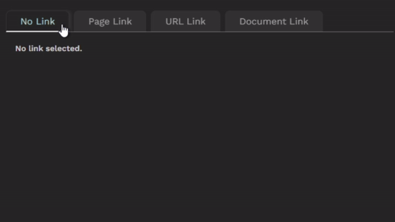
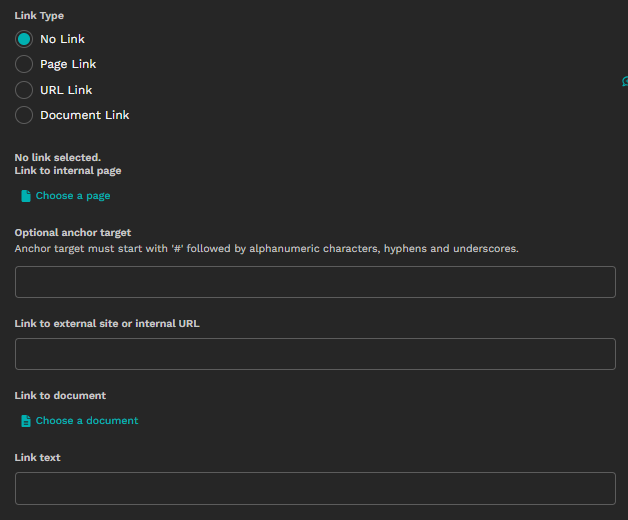
So far, so good. But without defining the custom StructBlockAdapter and css, we end up with the following page-and-a-half sized form:
LinkBlockAdapter
Before we get to creating the JavaScript StructBlockDefinition class and css file, we need a StructBlockAdapter to tie it all together and register it with Telepath.
We'll pass through a couple of parameters to the StructBlockDefinition:
link_types- the list of link types offered in this instance, used to set 'required' attributes on the 'path' child blocks before rendering. This indicates to the editor that, if page is the selected type, then choosing a page is required etc..url_link_text_required- used to set the 'required' attribute onlink_textwith the link type isurl_link.
We can find these parameters in this.meta in the StructBlockDefinition later.
Finally, we'll add our js and css files to the form media (we'll create these next).
Make sure the path you use here matches the path to your LinkBlock definition. In the example here, my LinkBlock is defined in the blocks app, in the module links.py. The js_constructor is then 'blocks.links.LinkBlock'.
You will also need to use the same path with registering the StructBlockDefinition with Telepath in the js file which we'll do in the next section.
class LinkBlockAdapter(StructBlockAdapter):
    js_constructor = "blocks.links.LinkBlock"

    def js_args(self, block):
        # keys added to args[2] found in this.meta in StructBlockDefinition
        args = super().js_args(block)
        # link types configured in LinkBlock class instance
        args[2]['link_types'] = block.link_types
        # add required '*' to link_text if url link selected and url_link_text_required==True
        args[2]['url_link_text_required'] = block.url_link_text_required
        return args

    @cached_property
    def media(self):
        from django import forms
        structblock_media = super().media
        return forms.Media(
            js=structblock_media._js + ["js/link-block.js"],
            css={"all": ("css/link-block.css",)},
        )


register(LinkBlockAdapter(), LinkBlock)
Defining a Custom StructBlockDefinition for the LinkBlock
As mentioned earlier in the article, there's too much information in this article to explain each step from beginning level up. I'll assume you're already either familiar with adding a custom StructBlockDefinition or have read through the links I shared in the Background Reading section.
Our custom StructBlockDefinition needs to perform the following tasks:
- Add the required '*' mark on link type path fields and, conditionally, on the link text field.
- Create an instance of a custom
LinkBlockclass that:- Styles the link type radio buttons and labels as tabs.
- Associates the link specific child blocks with the corresponding link type value.
- Listens for click events on the tabs - show only those child blocks relevant to the selected link type.
Comments in the code explain most of each step. I'll add a more conceptual summary after the code:
class LinkBlock {
    constructor(block, meta) {
        this.block = block;
        this.container = this.block.container[0];
        this.meta = meta;
    }

    initialize() {
        this.configureTabs();
        this.configureLinkTypeChildBlocks();
        // Show panels for initially selected tab, or first tab by default
        this.showPanels(
            this.container.tabs.buttons.find(button => button.checked) || this.container.tabs.buttons[0]
        );
    }

    configureTabs() {
        // the div container that wraps the radio button group
        const tabList = this.container.querySelector('div[id$="-link_type"]');
        // Modify link type styles - display as tabs
        tabList.role = "tablist";
        tabList.className = "w-tabs__list w-w-full link-block-tablist";
        // the div container that wraps each radio button
        tabList.querySelectorAll('div').forEach(div => {
            div.className = "link-block-tab";
        });
        // the radio button labels
        tabList.querySelectorAll('label').forEach(label => {
            label.className = "w-tabs__tab";
        });

        // Cache link type radio input elements
        this.container.tabs = { buttons: [...tabList.querySelectorAll('input[type="radio"]')] };

        // Hide redundant field label for 'link type' (but leave readable for screen readers)
        const linkTypeChildBlock = tabList.closest('[data-contentpath="link_type"]');
        linkTypeChildBlock.querySelector("label.w-field__label").classList.add('visually-hidden');

        // Listen for tab click events
        linkTypeChildBlock.addEventListener('click', event => this.handleTabClick(event));
    }

    configureLinkTypeChildBlocks() {
        // associate child blocks with link type button
        // child blocks should be declared with data-link-block-type='XX' where XX is the link_type value
        // the child block element is the div[data-contentpath] parent of the element with data-link-block-type
        // this 'XX' value is copied to the child-block container as data-parent-tab='XX'
        // this attribute is used to show/hide child blocks on tab click
        this.container.querySelectorAll('[data-link-block-type]').forEach(element => {
            const childBlock = element.closest('div[data-contentpath]');
            if (childBlock) {
                childBlock.setAttribute('data-parent-tab', element.dataset.linkBlockType);
            }
        });
        // If optional link, associate not_selected StaticBlock with the 'not selected' tab
        // null choice radio button has value==='' so data-parent-tab='')
        const noLinkSelectedText = this.container.querySelector('div[data-contentpath="not_selected"]')
        if (noLinkSelectedText) {
            noLinkSelectedText.setAttribute('data-parent-tab', '');
        }
        // cache all tab item child blocks
        this.container.tabs.tabItems = this.container.querySelectorAll('div[data-parent-tab]');
        // Cache link text child block and required mark
        this.container.linkTextSection = this.container.querySelector(
            '[data-contentpath="link_text"]'
        );
        this.container.linkTextRequiredMark = this.container.linkTextSection.querySelector(
            "label.w-field__label>span.w-required-mark"
        )
    }

    showPanels(activeTab) {
        // When tab with value='XX' clicked, only those child blocks with data-parent-tab='XX' are visible
        this.container.tabs.tabItems.forEach(div => {
            div.style.display = (div.dataset.parentTab === activeTab.value) ? 'block' : 'none';
        });
        // set the active tab styling
        this.container.tabs.buttons.forEach(button => {
            button.closest('div.link-block-tab').classList.toggle('active', button === activeTab);
            button.ariaSelected = (button === activeTab) ? "true" : "false";
        });
        // link text visible whenever active tab has a value (link type chosen)
        this.container.linkTextSection.style.display = (activeTab.value === '') ? "none" : "block";
        // show required mark for link_text if url_link_text_required set in blockDef.meta and URL Link is active tab
        if (this.meta.url_link_text_required) {
            this.container.linkTextRequiredMark.style.display = (
                activeTab.value === 'url_link' && this.meta.url_link_text_required
            ) ? "inline" : "none";
        }
    }

    handleTabClick(event) {
        event.stopPropagation();
        // find associated button - allows click on label and containing tab div
        let clickedTab = event.target.closest('div.link-block-tab');
        if (clickedTab) {
            let radioButton = clickedTab.querySelector('input[type="radio"]');
            if (radioButton) {
                this.showPanels(radioButton);
            }
        }
    }
}

class LinkBlockDefinition extends window.wagtailStreamField.blocks
    .StructBlockDefinition {
    render(placeholder, prefix, initialState, initialError) {
        // for each link type, mark the path field as required
        this.meta.link_types.forEach(link_type => {
            this.childBlockDefs.find(obj => obj.name === link_type).meta.required = true;
        })
        // add required mark for link text if url_link_text_required===true
        // required mark conditionally show if link_type==='url_link'
        if (this.meta.url_link_text_required) {
            this.childBlockDefs.find(obj => obj.name === 'link_text').meta.required = true;
        }
        // Wagtail block render
        const block = super.render(
            placeholder,
            prefix,
            initialState,
            initialError,
        );
        // initialise class var with structblock element
        new LinkBlock(block, this.meta).initialize();
        return block;
    };
}

window.telepath.register('blocks.links.LinkBlock', LinkBlockDefinition);
A summary of each class and method is described below.
LinkBlockDefinition
render()
- This is overriding the default Wagtail
render()method which renders the block on the admin form. this.childBlockDefsis the collection of block definitions for each child block in the StructBlock. Themeta.requiredattribute of each child block tells Wagtail whether to add the required '*' mark. This is only a visual aid and does not affect how the underlying form is validated on save.- Before
super.render()is called, we set themeta.requiredattribute totrueon those child blocks that set the path for each link type (defined by thelink_typesparameter we passed from the LinkBlockAdapter in the last step). - We also set the
link_textrequired attribute to true if we passedurl_link_text_requiredastruefrom the LinkBlockAdapter. - Once the StructBlock has been rendered, we create a new
LinkBlockinstance passing in theblockandmeta, and initialize the instance.
LinkBlock
initialize()
- We call two methods here:
configureTabs()&configureLinkTypeChildBlocks()(described below). showPanels()is called (described below) to set the visibility of child blocks according to the initial link type value.
configureTabs()
- This is mostly concerned with styling the radio buttons as tabs which is largely done using built-in Wagtail classes and some custom classes which we'll define later.
- The field label for
link_typeis hidden as it's visually redundant but left readable for screen readers, also done via a custom class. - A
clickevent listener is added to thelink_typechild block. This will trigger whenever any of the link type radio buttons are clicked.
configureLinkTypeChildBlocks()
- This method sets up child blocks that are particular to a link type. In the LinkBlock definition, we declared those fields with a custom
data-link-block-typeattribute. - For each element with this attribute, we add a
data-parent-tabattribute to the child block container for that element and copy in thedata-link-block-typevalue. The child block container is found as the closest ancestor element that matchesdiv[data-contentpath]. - By setting visibility on this parent element, we're toggling whether or not the child block is visible on the form. The value for each
data-link-block-typematches alink_typeradio button value, so we can later set visibility on those values that match while hiding those that don't. - If the LinkBlock was initialised with
required=False, we will have rendered a StaticBlock to display a message beneath the 'unselected' tab. At this stage, it's not associated with any link type value. Because the 'unselected' radio button has an empty value, we can adddata-parent-tab=''to the StaticBlock element to link the two and handle it consistently with the other values.
showPanels()
- As the name suggests, this method handles toggling visibility on blocks associated with link types.
- Of the child blocks with a
data-parent-tabattribute, those that match the value of the currently selected radio button are setdisplay: block;, all others are setdisplay: none;to hide them from view. - The selected button is styled accordingly and the
aria-selectedattribute set. - The
link_textchild block visibility is set according to whether the selected radio button has a value (effectively hiding it when 'unselected' is active). - Finally, the required '*' mark is displayed for
link_textifurl_link_text_requiredwas passed as true and if the active button value isurl_link. It is hidden for all other cases.
handleTabClick()
- This is the method called by the
clickevent listener defined earlier inconfigureTabs. - The code finds the associated radio button using the
event.targetand passes this into theshowPanels()method.
Finally, the LinkBlockDefinition is registered with Telepath using the same class path we set in the js_constructor attribute of the LinkBlockAdapter earlier on.
Note that the ListBlock class is instantiated separately from the StructBlockDefinition class to ensure proper functionality when using LinkBlock within a ListBlock. Without this separation, the element variables would be overwritten each time a new LinkBlock is created. This would cause all event listeners to reference only the elements of the most recently created LinkBlock. For instance, clicking on a tab in an earlier ListBlock would incorrectly trigger an event listener that manipulates elements from the latest LinkBlock instead.
Styling the LinkBlock
At this point, we have the interactive features activated but there is still some styling left to do.
The tab list has already been styled with Wagtail classes (w-tabs__list w-w-full) as well as the radio button labels (w-tabs__tab). These are the style applied to the Content/Promote tabs at the top of the Page editor for example. This groups the radio buttons horizontally and provides a hover style.
The custom css will:
- Hide the radio button ◉ input element.
- Style the radio button labels and containers as tabs.
- Add some hover and active link type styling.
- Hide the link type label while leaving it readable to screen readers.
- Tidy up some extra spacing to provide a better visual experience.
As before, I've added comments to the code to explain each style.
/* visually hide element while leaving readable to screen readers */
.visually-hidden {
position: absolute;
width: 1px;
height: 1px;
margin: -1px;
padding: 0;
overflow: hidden;
clip: rect(0, 0, 0, 0);
border: 0;
}
/* space under label and after structblock */
div.link-block {
margin-block-start: 1em;
margin-block-end: 1em;
}
/* remove excess space after child blocks */
div.link-block div.w-field__wrapper {
margin-bottom: 0;
}
/* container for link type radio buttons */
div.link-block-tablist {
position: relative;
flex-wrap: wrap;
z-index: 0;
/* remove redundant space */
padding-inline-start: 0;
padding-inline-end: 1rem;
margin-top: -1rem;
}
/* add border beneath tabs */
div.link-block-tablist::after {
content: "";
position: absolute;
top: 0;
left: 0;
right: 0;
bottom: 0;
border-bottom: 1px solid var(--w-color-text-context);
opacity: 0.3;
pointer-events: none;
}
/* override wagtail core style .w-tabs__list>:not([hidden])~:not([hidden]) */
/* reduce space between tabs */
div.link-block-tablist> :not([hidden])~:not([hidden]) {
margin-inline-start: calc(0.5rem*(1 - var(--tw-space-x-reverse)));
}
/* radio button container - restyle as tab */
div.link-block-tab {
padding: 0 1rem;
margin-top: 1rem;
color: var(--w-color-text-label);
border-width: 0.0625rem 0.0625rem 0 0.0625rem;
border-color: var(--w-color-border-furniture);
border-radius: 0.5rem 0.5rem 0 0;
cursor: pointer;
background-color: var(--w-color-surface-field-inactive);
opacity: 0.9;
}
/* link type tab label */
div.link-block-tab>label {
padding: 0.5rem;
margin-bottom: -1px !important;
margin: 0;
cursor: inherit;
opacity: .8;
color: inherit;
}
/* style active tab & label */
div.link-block-tab.active {
background-color: var(--w-color-surface-field-active);
border-bottom-style: solid;
border-bottom-width: 2px;
border-bottom-color: var(--w-color-text-context);
box-shadow: 4px 0px 4px var(--w-color-border-furniture);
opacity: 1;
}
div.link-block-tab.active label {
opacity: 1;
}
/* tab hover style */
div.link-block-tab:hover, div.block-tab>label:hover {
color: var(--w-color-text-link-hover);
opacity: 1;
}
/* hide radio button ◉ input element */
div.link-block-tab>label>input {
position: absolute;
clip: rect(0, 0, 0, 0);
}
/* add horizontal padding to tab item structblocks */
div.link-block > div[data-contentpath]:not([data-contentpath='link_type']),
.link-block-no-selection {
padding: 0.5rem 0 0 1rem;
}
/* add extra space after 'no linkselected' StaticBlock */
div.link-block > div[data-contentpath='not_selected'] {
margin-block-end: 2rem;
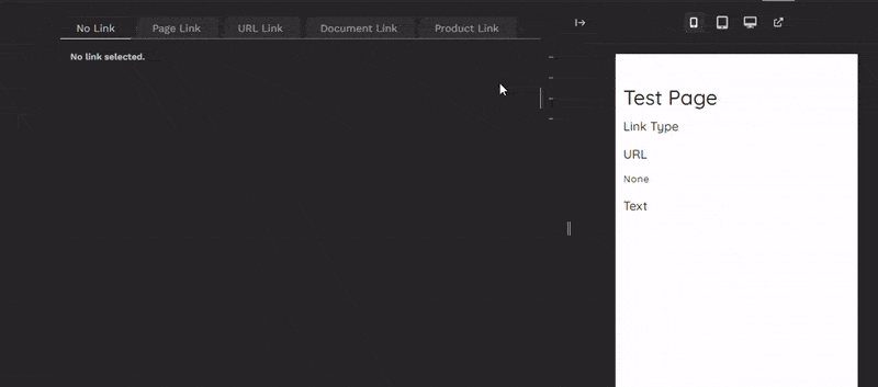
}That's the final piece in place now. The link types are now displayed as tabs with the child blocks displaying interactively according to the selected tab:
Custom Link Types
If your site has a need to create links for types not served by the standard Wagtail choosers, you can extend the LinkBlock to add this type easily enough.
Suppose I have a Product model viewed on my site via a routable page model (ProductPage).
The Product model has a title and unique sku field. The ProductPage model has a route to show the product detail defined as:
class ProductPage(RoutablePageMixin, Page):
    ....
    @path("<str:sku>/")
    def product_detail(self, request, sku):
        try:
            product = Product.objects.get(sku=sku, live=True)
            return self.render(
                request,
                context_overrides={
                    "product": product,
                },
                template="product/product_detail.html",
            )
        except:
            ....
The client would like a link type that allows the editor to select a product from a custom product chooser and return the product title and the url to the detail page for that product.
First, I need to add 'product' to the LinkTypeChoiceBlock. This means adding it to the valid_link_types class attribute and to the choices local variable:
class LinkTypeChoiceBlock(ChoiceBlock):
    ....
    valid_link_types = ['page', 'url_link', 'document', 'product']

    def __init__(self, link_types=valid_link_types, unselected_label=_("No Link"), required=True, default=None, *args, **kwargs):
        ....
        choices = [(key, value) for key, value in [
            ('page', _('Page Link')),
            ('url_link', _('URL Link')),
            ('document', _('Document Link')),
            ('product', _('Product Link')),
        ] if key in link_types]
        ....
I need to create a subclassed version of my chooser (ProductChooserBlock) using the DataChooserBlockMixin, just we did with the other choosers and blocks, so that it can be associated with the 'product' link type using the data-link-block-type attribute.
class DataProductChooserBlock(DataChooserBlockMixin, ProductChooserBlock):
    pass
In the LinkBlock class, I add the product child block before 'Link Text' and add a check in the clean method that ensures a product has been chosen if product was the selected link type.
Note that the child block name for the product chooser must match link type value (so, in this case, 'product').
class LinkBlock(StructBlock):
    def __init__(
        self,
        required=True,
        link_types=LinkTypeChoiceBlock.valid_link_types,
        default_link_type=None,
        url_link_text_required=True,
        _unselected_label=_("No Link"),
        _unselected_description=_("No link selected."),
        **kwargs
    ):
        ....
        if 'product' in link_types:
            local_blocks += (
                ('product', DataProductChooserBlock(
                    required=False,
                    label=_("Link to product"),
                    attrs={'data-link-block-type': 'product'},
                    chooser_attrs={'show_edit_link': False}
                )),
            )
        ....

    def clean(self, value):
        ....
        match selected_link_type:
            ....
            case 'product':
                document = value.get('product')
                if not document:
                    errors['product'] = ErrorList(
                        [_("Please select a product to link to")])
        ....
Finally I need to add the case for 'product' to the LinkValue to return url and text:
class LinkValue(StructValue):
    ....
    def url(self) -> str:
        """Return a link's url regardless of link type"""
        try:
            match self.get("link_type"):
                ....
                case 'product':
                    from product.models import Product, ProductPage
                    base_page = ProductPage.objects.first()
                    sku = self.get('product').sku
                    product = Product.objects.filter(sku=sku).first()
                    if product and base_page:
                        if self.i18n_enabled:
                            product = product.localized
                            base_page = base_page.localized
                        product_url_part = base_page.reverse_subpage(
                            name='product_detail', kwargs={'sku': product.sku})
                        return f"{base_page.url}{product_url_part}"
                    return ''
                ....
    def text(self) -> str:
        """Return link text - default to object title for page and document links"""
        link_text = self.get("link_text")
        if link_text:
            return link_text
        else:
            try:
                match self.get("link_type"):
                    ....
                    case 'product':
                        return self.get("product").title
                ....
In the case of this example, there is only ever one instance of the ProductPage class, it's sufficient to just get the first object. If your model had a get_absolute_url method, you'd use that here instead.
That's all that's needed to add the custom link type. Apart from the process to reverse the product url, everything else is just more or less a matter of cloning existing types and editing to suit.
The LinkBlockDefinition Telepath class already has all it needs to render and handle the extra choice type.
Conclusion
In this article, we set out to create a flexible and reusable StructBlock within Wagtail, dedicated to simplifying the management of diverse link types.
Recognizing the fundamental need to integrate link fields into StructBlocks, we have overcome a number of obstacles along the way, such as allowing for a variety of link kinds without any prior knowledge, reducing visual clutter for content editors, and guaranteeing uniform usability for all link options.
Our main goal was to create a small, light-weight, interactive tabbed interface that allows content creators to easily choose text, path, and link type while maximising available page space in the editing interface.
We've looked at several technical concepts that were critical to achieving our goal:
- Converting Django's radio select widget into a tab group.
- Creating an interactive panel interface within the StructBlock using a custom Telepath class
- Dynamically adding child blocks based on initial parameters
- Integrating data attributes into block forms
- Using custom StructValue classes to return calculated values from the stored data
- Designing adaptable choice blocks.
In upcoming articles, I'll show how to create a StreamField based menu system that makes use of this block and several of the concepts covered here.
Thanks for reading, I hope this has been useful for you. If you have any questions, feel free to post those below or contact me directly.