
Add Heading Blocks with Anchor Targets in Wagtail
Introduction
Wagtail’s Draftail rich text editor lacks any way to add anchor identifiers to heading tags so that you can link back to that position on the page from elsewhere.
To get around this limitation, we can create a simple block to add to your StreamFields that includes heading size, alignment and an optional anchor identifier. We'll use flexible, custom ChoiceBlocks to populate field values, include some validation to ensure the entered anchor identifier is a valid slug and then create a custom template to render the final heading.
I'll also show you how you can customise the StructBlock form styling and layout in the admin interface without needing to create custom templates.
This is a good example to work through if you're starting out with Wagtail and getting used to working with blocks and StreamFields.
If you’re looking to add a table of contents, check out my previous blog on a way to automate this using a custom block, including generating the heading anchor identifiers. The table of contents above was created with this block.
This example is as much about proof-of-concept as anything else. You could also install the wagtail-draftail-anchors package from PyPi which is currently under consideration as a feature request for Draftail. The drawback of this package is that if you try to add a link over an anchor target, it will crash the editor and require a page reload to continue. It's a limitation of draftail not handling when two entities overlap.
For clarity, in this article, I refer to anchor identifier to be the id attribute of an HTML element (e.g. <div id="some_identifier">) that can be used as an anchor target (<a href="#some_identifier">Some link</a>).
The Heading Block
We’ll need four fields for a basic heading block:
- Heading text (
CharBlock) - Size (
ChoiceBlock) - Alignment (
ChoiceBlock) - Optional anchor identifier (
CharBlock)
The alignment can be left off if you’ll use a consistent alignment on all your headings throughout your site.
We'll create the block in core/blocks/heading-block.py where core is an app I use to keep code common to multiple apps. Adjust to your use case.
Imports
The imports you’ll need for the code on this page:
import unidecode
import validators
from django import forms
from django.forms.utils import ErrorList
from django.utils.functional import cached_property
from django.utils.text import slugify
from django.utils.translation import gettext_lazy as _
from wagtail.blocks import CharBlock, ChoiceBlock, StructBlock
from wagtail.blocks.struct_block import (StructBlockAdapter,
                                         StructBlockValidationError)
from wagtail.telepath import register
In case unidecode or validators doesn't resolve, you'll need to install it with pip install unidecode / pip install validators or equivalent for your environment.
The Choice Blocks
If you’re not familiar with Wagtail StructBlocks, setting a block field type to ChoiceBlock will render a drop-down selector on the edit interface with the options you list in an array of tuples [(value, label), ... ].
Set the default for the ChoiceBlock in the StructBlock field definitions rather than the ChoiceBlock itself.
Alignment Choice Block
The alignment option is a standard ChoiceBlock which will be substituted into the template as a BootStrap class (text-start, text-center etc.):
class TextAlignmentChoiceBlock(ChoiceBlock):
    choices = [
        ('justify', _('Justified')),
        ('start', _('Left')),
        ('center', _('Centre')),
        ('end', _('Right'))
    ]
    def __init__(self, default=None, required=True, **kwargs):
        super().__init__(self.choices, default, required, **kwargs)
Heading Size Choice Block
For better SEO, H1 should be reserved for your page title only and placed only once per page, near the top.
Also, for better SEO, you should always descend heading levels in sequence (i.e. H2 to H3, not H2 to H4).
SE Ranking has a good discussion on the use of heading tags and their implications for SEO.
With this block, I'll show you how you can filter a list of offered options based on parameters set when initialising the block.
The possible heading size range should be from H2 down to a minimum of H6, but we'll add a heading_range parameter to the ChoiceBlock to set that range for each use case and default it to H2-H4.
class HeadingSizeChoiceBlock(ChoiceBlock):
    default_choices = [
        ('h2', 'H2'),
        ('h3', 'H3'),
        ('h4', 'H4'),
        ('h5', 'H5'),
        ('h6', 'H6'),
    ]

    def __init__(self, heading_range: tuple = ('h2', 'h4'), default=None, required=True, **kwargs):
        # Find the indices of the elements in heading_range within default_choices
        start_index = next((i for i, (value, _) in enumerate(
            self.default_choices) if value == heading_range[0]), None)
        end_index = next((i for i, (value, _) in enumerate(
            self.default_choices) if value == heading_range[1]), None)
        # Filter default_choices based on the indices
        choices = self.default_choices[start_index:end_index + 1]
        super().__init__(choices, default, required, **kwargs)
Now, if for some reason I wanted to offer H3-H5 as the range of choices elsewhere, I can call the choice block with:
HeadingSizeChoiceBlock(heading_range=('h3', 'h5'))Because I use these choice blocks regularly, I keep them in a separate module and import from there.
The Block Code
Here, we'll create the block model and set field types, defaults, labels etc..
- Because this block could be used as child block of another StructBlock where the
requiredattribute may beTrueorFalse, and where we may want to set different defaults for heading size and alignment, we can declare the child blocks as local variables rather than fixed class attributes. The use oflocal_blocksfor this purpose is described in more detail in this article. - Set the defaults to values suitable for your site.
- In the
class Meta, set the template to a suitable location and add any label or icon you want.
class HeadingBlock(StructBlock):
    def __init__(
            self,
            required=True,
            heading_range=('h2', 'h4'),
            default_size='h2',
            default_alignment='start',
            **kwargs):
        local_blocks = (
            ("title", CharBlock(
                label=_("Title"),
                required=required,
            )),
            ("heading_size", HeadingSizeChoiceBlock(
                label=_("Size"),
                heading_range=heading_range,
                default=default_size
            )),
            ("alignment", TextAlignmentChoiceBlock(
                label=_("Alignment"),
                default=default_alignment,
            )),
            ("anchor_id", CharBlock(
                label=_("Optional Anchor Identifier"),
                required=False,
            )),
        )
        super().__init__(local_blocks, **kwargs)

    class Meta:
        template = 'blocks/heading_block.html'
        label = _("Heading Block")
        form_classname = "struct-block heading-block"
        icon = 'title'

    def clean(self, value):
        errors = {}
        anchor_id = value.get('anchor_id')
        if anchor_id:
            if not validators.slug(anchor_id):
                slug = slugify(unidecode.unidecode(anchor_id)) or slugify(
                    unidecode.unidecode(value.get('title')))
                errors['anchor_id'] = ErrorList([_(f"\
                    '{anchor_id}' is not a valid slug for the anchor identifier. \
                    '{slug}' is the suggested value for this.")])
                raise StructBlockValidationError(block_errors=errors)
return super().clean(value)Declaring the child blocks in this manner means we can now nest this inside another StructBlock and set the required attribute and propagate that to the title block while also setting custom defaults for heading_size and alignment:
class CSVTableBlock(StructBlock):
    title = HeadingBlock(
        label=_("Optional Table Title"),
        required=False,
        heading_range=('h3', 'h5'),
        default_size='h4',
        default_alignment='center'
    )
    ....
In this example, the HeadingBlock is declared as an optional child block with available heading sizes ranging from h3 to h5, defaulting to h4, and default center alignment. If the HeadingBlock child blocks had been declared as class attributes, changing these default values on a per use case like this would not have been possible.
The custom clean() method uses the validators.slug() method to check if the anchor_id is a valid slug (if supplied) before calling the StructBlock super().clean() method:
If anchor_id is not a valid slug, an error is raised on the anchor_id field with a suggested slug based on the anchor_id value.
- '$%some words & symbols??!!' is not a valid slug for the anchor identifier. 'some-words-symbols' is the suggested value for this.
To get the suggested value, the following occurs with the anchor_id value:
- First,
unidecodewill transliterate any extended ASCII characters: "mørden æsops" will be returned as "morden aesops" for example. slugifywill turn any string into a valid slug – special characters stripped out and spaces replaced by dashes: "$%some words & symbols?!!" becomes "some-words-symbols".slugifywill just drop any extended ASCII which is why it's a good idea to rununidecodefirst.
If the result of that is an empty string, the code will perform the same process on the title value instead.
You could avoid the custom validation by using a RegexBlock for the anchor target with regex='^[a-z0-9]+(?:[_-][a-z0-9]+)*$'. I prefer the more helpful error message you get with the above method however.
Warning
While this validation will check for a valid anchor identifier, there is no way to check that theidattribute will be unique on the rendered HTML page. Duplicate ID's can produce unexpected outcomes; it's the editor's responsibility to ensure that theidis distinct.
The Template
This is a simple block template with the values from the block instance substituted into the appropriate places. Note that anchor_id is wrapped in a conditional statement so that the id attribute is only added where a value for anchor_id has been entered.
<{{ self.heading_size }}{% if self.anchor_id %} id="{{ self.anchor_id }}"{% endif %} class="text-{{ self.alignment }}">
    {{ self.title }}
</{{ self.heading_size }}>
If using this as a child block inside of another StructBlock, you may choose to just render it directly in the template for that parent block.
In the example of the CSVTableBlock above, the HeadingBlock name is title. A table title is not semantically a heading, so the HeadingBlock is rendered as styled body text rather than as a heading element.
<p class="text-{{ self.title.alignment }} {{ self.title.heading_size }}"
   {% if self.title.anchor_id %} id="{{ self.title.anchor_id }}"{% endif %}>
   {{ self.title.title }}
</p>
The front end css has accompanying classes for each heading element (h2, .h2 {....}, etc.) that allow the use of heading specifications as styles.
Styling the Block Form
This section is entirely optional, if you just want to use the default Wagtail block form styling, skip ahead to the next section.
One thing I find less than optimal with Wagtail is the amount of screen space taken up by simple forms in the admin interface. These four fields take up most of a screen with 1080px height. That's pretty excessive.
This section will use flex to add some responsive styling that will continue to render the title field on its own row but align the other fields on the same row, wrapping only for smaller screen sizes.
Because the anchor_id field has a help text and may also show an error message for invalid input, I change the order of those so that they appear below the input to keep that aligned with the select elements on the same row.
First, below the HeadingBlock, we need to create a StructBlockAdapter to load the custom css file we will create shortly:
class HeadingBlockAdapter(StructBlockAdapter):
    @cached_property
    def media(self):
        return forms.Media(
            css={"all": ("css/admin/heading-block.css",)},
        )

register(HeadingBlockAdapter(), HeadingBlock)
This will ensure the css file is loaded whenever we're using the block.
Next, we can create the css file in the path we specified above in the StructBlockAdapter (css/admin/heading-block.css).
In our HeadingBlock.Meta definition, we specified a form class with:
form_classname = "struct-block heading-block"These classes are used on the StructBlock form and let us use the heading-block class to select only child elements of this block type and not others on the same page:
/* structblock form root */
/* use flex to display child elements inline and wrap where needed */
div.heading-block {
    display: flex;
    flex-wrap: wrap;
    column-gap: 1rem;
}
/* set title to full width */
div.heading-block div[data-contentpath="title"] {
    flex-basis: 100%;
}
/* heading select */
div.heading-block div[data-contentpath="heading_size"] {
    flex-basis: 120px;
}
/* alignment select */
div.heading-block div[data-contentpath="alignment"] {
    flex-basis: 170px;
}
/* move comment button closer on select fields */
div.heading-block div[data-contentpath="heading_size"] button.w-field__comment-button,
div.heading-block div[data-contentpath="alignment"] button.w-field__comment-button {
    inset-inline-end: -0.5rem;
}
/* anchor identifier - uses remaining space on row, wraps when space is less than 50% */
div.heading-block div[data-contentpath="anchor_id"] {
    flex-grow: 1;
    flex-basis: 50%;
}

/* anchor identifier modifications */
/* move error and help text after input */
div.heading-block div[data-contentpath="anchor_id"] div.w-field {
    display: flex;
    flex-wrap: wrap;
}
div.heading-block div[data-contentpath="anchor_id"] div.w-field div.w-field__help {
    order: 1;
    margin: 0.5em 0.5em 0 0.5em;
}
div.heading-block div[data-contentpath="anchor_id"] div.w-field div.w-field__errors {
    order: 2;
    display: flex;
}
/* keep error message on same line as warning icon */
div.heading-block div[data-contentpath="anchor_id"] div.w-field p.error-message {
    display: inline;
}
/* allow extra width due to flex display */
div.heading-block div[data-contentpath="anchor_id"] div.w-field svg.w-field__errors-icon {
    width: 1.5em;
}
/* let input element grow to available space */
div.heading-block div[data-contentpath="anchor_id"] div.w-field div.w-field__input {
    width: 100%;
}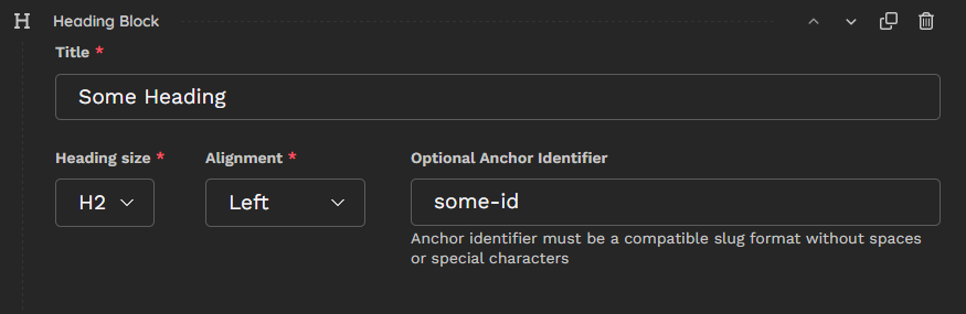
The Finished Block
I’ll create an <h5> tag with "an-example" for anchor identifier:
An Example Heading Block
If you inspect the heading, you’ll see the id attribute has been set:
<h5 id="an-example">An Example Heading Block</h5>To create a link to the heading, use the 'Anchor Link' option in Draftail’s hyperlink form: Link to heading.
Conclusion
In this example, we built a StructBlock to create headings with optional anchor identifiers using customised ChoiceBlocks, custom validation and basic template logic.
We also went through a method to customise the StructBlock form in the admin interface to create a more compact and responsive layout without the need for custom form templates.
This is a basic but important block for any Wagtail site using StreamField's. It provides a simple way to create headings with adjustable size and alignment. It also overcomes the limitation of Draftail not having the function to add anchor identifiers to headings.
In the next couple of blogs, I'll go over setting up a rich text block and how to extend the features of Draftail.