
Adding Multi-column Formats to R Markdown Documents
Introduction
I spent a long while looking for a way to display R Markdown content in multiple columns. I tried inserting alternating HTML and R code blocks, but knitr just seemed to auto close any open HTML element tags, which defeated the purpose.
It is possible to insert script tags inside raw HTML blocks and run your R code from there, but this is kind of nasty and takes the code out of the runnable framework, which is not a good idea where variables are being created/modified and used later on.
Using the Colon ::: Notation
R Markdown supports some basic HTML elements. It also has its own notation for the <div> tag using the triple colon notation ::: for both opening and closing the element and, unlike using <div>, knitr won't auto-close these.
Note:
Three colons is the minimum, though you can use more - adding more can be helpful to visualise nesting levels in your code.
The notation is followed by braces {...} enclosing any syntax you might normally put inside a <div> opening tag, for example:
::: {align="center" class="column" style="padding-right:3px;"}Important!
You must supply the braces{}following the:::notation. Without this, the knitr compiler will just read it as a string. For a straight<div>tag with no extra definitions, just supply empty braces::: {}.
For the case of displaying data alongside a graph, it's possible to use the position variable as discussed in the previous article.
A far more generic way of producing the same result so that the two columns can be filled with any producible R Markdown content can be written:
::: {}
  ::: {.column width="40%"}
    table ...
  :::
  ::: {.column width="60%"}
    graph ...
  :::
:::
Where .column is a default CSS class defined as:
div.column {
    display: inline-block;
    vertical-align: top;
    width: 50%;
}Note:
Writing{.column width="40%"}is a shorthand for{class="column" width="40%"}. This shorthand can be used when specifying a single CSS class.
Creating Responsive Columns
R Markdown isn't normally associated with responsive layout. It is possible however to take advantage of the ::: colon notation and use this to create flex grids for example.
Using bootstrap classes, I could re-write the above as:
::: {.row}
  ::: {.col-md-4}
    table ...
  :::
  ::: {.col-md-8}
    graph ...
  :::
:::
Now my content will only split into columns for medium screens and above (≥768px) with a 1:2 width ratio (i.e. 33%, 67%).
Example: Creating a bootstrap flex-grid with mtcars
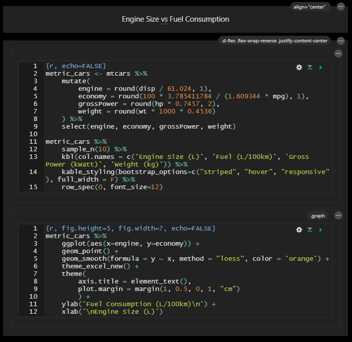
Here's an example in action using the mtcars R data table, displaying a table alongside the accompanying graph.
The goal is to display the table alongside the graph only where space permits, otherwise place the graph above the data. I'll be placing the graph to the right, so to achieve graph above data, I'll be using flex-wrap-reverse.
For the nested div's, I add extra colons to help readability.
```{r message=FALSE, warning=FALSE, include=FALSE}
library(ggthemes)
library(kableExtra)
library(ggplot2)
library(dplyr)
data("mtcars")
```

@import url("https://cdn.jsdelivr.net/npm/bootstrap@5.0.2/dist/css/bootstrap.min.css");
.main-container {
    max-width: 95%;
}
.graph img {
    max-width: 100%;
}

::: {align="center"}
  Engine Size vs Fuel Consumption
:::

::: {class="d-flex flex-wrap-reverse justify-content-center"}
  ::::: {}
    ```{r, echo=FALSE}
    metric_cars <- mtcars %>%
        mutate(
            engine = round(disp / 61.024, 1),
            economy = round(100 * 3.785411784 / (1.609344 * mpg), 1),
            grossPower = round(hp * 0.7457, 2),
            weight = round(wt * 1000 * 0.4536)
        ) %>%
        select(engine, economy, grossPower, weight)

    metric_cars %>%
        sample_n(10) %>%
        kbl(col.names = c('Engine Size (L)', 'Fuel (L/100km)', 'Gross Power (kWatt)', 'Weight (kg)')) %>%
        kable_styling(bootstrap_options=c("striped", "hover", "responsive"), full_width = F) %>%
        row_spec(0, font_size=12)
    ```
  :::::

  ::::: {.graph}
    ```{r, fig.height=5, fig.width=7, echo=FALSE}
    metric_cars %>%
        ggplot(aes(x=engine, y=economy)) +
        geom_point() +
        geom_smooth(formula = y ~ x, method = "loess", color = 'orange') +
        theme_excel_new() +
        theme(
            axis.title = element_text(),
            plot.margin = margin(1, 0.5, 0, 1, "cm")
        ) +
        ylab('Fuel Consumption (L/100km)\n') +
        xlab('\nEngine Size (L)')
    ```
  :::::
:::
Walking through the code above:
CSS
- Import the bootstrap CSS from CDN.
- Set the knitr CSS
main-containerclass maximum width to 95% (it's set to 940px by default for some reason and will limit all your content to that width). - Add a definition for
imgtags that inherit the graph class to limit maximum width to 100% of available space. The graph tag doesn't exist, it's used in the declaration below to define thegraphdiv container. On a straight knitr output, it's not necessary as this already exists in the defaultimgCSS definition. On this site, without this declaration, the image will overflow on screens smaller than the output image.
Header
- Start off by creating a centred heading using a pair of Markdown
:::div tags. Because it's not a true 'Heading' in the document sense of the word, I'll use theh3class rather than theh3element.
Parent div
- Add the parent div element that will contain the table and graph div's. We'll use a
d-flexcontainer with wrap order reversed (so that right column goes above left when the container wraps) usingflex-wrap-reverse, and centre the content withjustify-content-centerto keep both together on wide screen, and aligned on smaller screens.
Table div
- Add the first nested div element that will contain the table data. There is no extra definition for this element, so empty braces are supplied:
::::: {} - Create a new data set and convert
- Cubic inches to litres for the engine size
- Fuel consumption from miles per (US) gallon to litres per 100km
- Horsepower to kilowatts
- Weight to kilograms
- Pass a random 10 rows from that data set into a
kabletable in the first column and reduce the header font size a little. Usingkable_styling()was covered in the previous article.
Graph div
- Add the second nested div element that holds the graph and add the
graphCSS class (for reasons described above):::::: {.graph} - In the this element we pass the full data set into a
ggplotpoint graph with smoothing. The plot top margin layer just nudges the graph down a little to align with the table while the left padding provides a little spacing from the table when displayed alongside.
Output
This will give you the following output:
Engine Size vs Fuel Consumption
| Engine Size (L) | Fuel (L/100km) | Gross Power (kWatt) | Weight (kg) | |
|---|---|---|---|---|
| Maserati Bora | 4.9 | 15.7 | 249.81 | 1619 |
| Merc 450SE | 4.5 | 14.3 | 134.23 | 1846 |
| Cadillac Fleetwood | 7.7 | 22.6 | 152.87 | 2381 |
| Datsun 710 | 1.8 | 10.3 | 69.35 | 1052 |
| Ford Pantera L | 5.8 | 14.9 | 196.86 | 1438 |
| Lincoln Continental | 7.5 | 22.6 | 160.33 | 2460 |
| Merc 230 | 2.3 | 10.3 | 70.84 | 1429 |
| Mazda RX4 Wag | 2.6 | 11.2 | 82.03 | 1304 |
| Merc 450SL | 4.5 | 13.6 | 134.23 | 1692 |
| Camaro Z28 | 5.7 | 17.7 | 182.70 | 1742 |

Resize your browser to see the way the columns adjust, including what happens at the breakpoint when the two div widths exceed the available space (at around 1430px).
Creating Columns with the Visual Editor
If you're using R Studio with the visual editor, you can add columns using Insert > DIV, creating an empty wrapper DIV of class .columns and adding child DIV's with Classes set to .column and width=x% in 'Other'.
Personally, I find this quite fiddly and prone to some 'surprise' behaviour - quicker to type/paste in the code in base view then flip back to visual mode afterwards. You can access all the properties from there:
Conclusion
The ::: colon div notation is a powerful way to quickly output multiple column formatted data on your R Markdown documents.
When combined with CSS, you can render rich responsive HTML directly from your .rmd file just using standard knitr.
Hopefully if you've found this from searching for the answers like I was, you'll find this useful.